


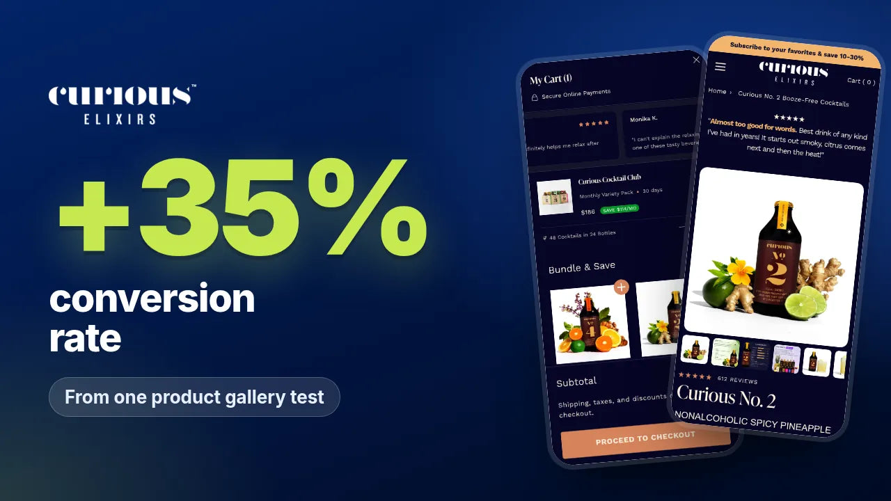

Subscribe and Save Best Practices: 7 Tests Worth Running on Shopify

The best subscribe and save offers on Shopify do four things: they show the saving in money next to the one time price, give a reason to subscribe beyond the discount, put skip, pause and cancel in plain sight, and repeat the offer in the cart. Get those right and a discount you already pay for starts to win more subscribers, without making it any bigger.
Most stores treat subscribe and save as a toggle with a percentage badge. Customers read it differently. They are being asked to agree to future charges, so they want to know what they save, what else they get, how often it arrives and how easy it is to stop.
At PM Digital, Paddy McLarnon and the team design and test subscription offers for Shopify brands. Our view is simple: the offer and the way it is explained usually matter more than another layout change. This guide covers the subscribe and save best practices we use, the tests we would run first, and the results behind them from our published case studies. Where a figure covers a whole programme rather than one test, we say so.
What a subscribe and save offer has to explain
Before you test anything, check that your offer answers the four questions every new subscriber has.
The rule we work to: if a customer could subscribe without knowing the price, the frequency and how to cancel, the offer is not finished. Unclear terms cost you subscribers now and refunds later.
Seven subscribe and save tests worth running
These are the tests we usually run first on a subscription store, in roughly the order we would run them. Each one comes from work on a live Shopify brand.
1. Show the saving in money, next to the one time price
On Avantera, the original buy box led with a price per serving, a toggle and a list of terms. Customers were being asked to understand the saving without seeing the actual price difference.
The winning version showed the one time price beside the discounted subscription price, with the delivery cadence and "pause or cancel anytime" in one line underneath. That pattern then became the way subscription savings were shown across the whole funnel: the price you would pay, the price you pay and the gap between them.
We then tested different offer structures and how the monthly price was framed. One experiment increased the share of orders on subscription from 90% to 97%, at 97% confidence.
2. Give people a reason to subscribe beyond the discount
On Cadence, a standard subscribe and save discount was not enough. We tested different incentives, including 30% off the first subscription order, 15% off recurring deliveries, an exclusive Cadence cap, gifts across future deliveries, digital fuelling guides and flexible subscription management.
Staging the gifts across the first three deliveries gives a new subscriber something to look forward to on the second and third orders, when many new subscribers decide whether to stay. On the Funnel First podcast, Matty from Cadence said the merchandise was one of the strongest parts of the strategy: "the biggest one honestly is the merch like the cap".

Across the programme we tested ten offer structures, and Cadence's subscription take rate sat around 70%, with a peak of 80%. That figure reflects the whole programme, not one test. If you want to check whether a richer offer still makes money, our offer calculator runs the numbers.
3. Put skip, pause and cancel in plain sight
On Kiko Vitals, the saving was there, but the delivery frequency, what subscribing committed you to and how to pause were not. Fewer people subscribed, and some of those who did asked for refunds because they had not realised.
We rewrote the buy box and cart on every product page with the same structure: the one time price, the subscribe and save price with the saving spelled out, the delivery frequency, free delivery where it applies, and "pause, skip or cancel anytime" in plain sight.
Compared with the four months before, subscription sales through Appstle rose 64% and total sales rose 29%, and 26% of total sales are now on subscription. Those figures cover the whole rebuild, including bundles and promotions, rather than the buy box alone, but almost all of the growth came through subscription.
4. Name the option after the benefit, not the mechanism
"Subscribe" describes what the customer has to do. A label like "Buy more, pay less" describes what they get. On Adegen, the original mobile buy box used text buttons for packages and listed the subscription terms as a block of text.
The winning version showed product images on each package, flagged the most popular and biggest saving options, and led the subscription choice with "Buy more, pay less" and the saving. Mobile conversion rate rose 40% and revenue per visitor rose too, with a 97% probability to beat control. The label was one of several changes in that buy box, so treat it as a test of the whole structure rather than a single line of copy.

5. Repeat the offer in the cart as an upgrade
Plenty of shoppers add a one time purchase and only think about subscribing once they see their cart. On Natrava, we improved how the subscription saving, free shipping and flexibility were explained in the cart drawer.
The upgrade block spells out the saving, free shipping on the first subscription order and "modify, skip or cancel anytime", with a single Upgrade and Save button. In the winning test, subscription revenue per visitor rose 9% and conversion rate rose 7%. Overall subscription share barely moved, so the gain came from converting more visitors, not from pushing existing buyers into a plan.

6. Match the frequency to how fast the product is used
A customer who receives product faster than they use it will skip, pause or cancel, however good the price looks. Set the default frequency from real usage, keep the choice to two or three options, and show it before the customer adds to cart.
If a product gets skipped a lot, try a longer default frequency before you try a bigger discount. Our guide to cutting month three churn covers what to do once people have subscribed.
7. Explain first order offers and defaults honestly
A bigger saving on the first order, such as Cadence's 30% off followed by 15% on recurring deliveries, can be a strong offer. It only works if the customer can see what they pay today and what they will pay next. Shopify's own subscription guidance asks themes to explain how the price changes over time.
The same applies to defaults. Whichever option is selected when the page loads, keep the one time option visible and the terms next to the price, and check the rules for the markets you sell into. Our guide to increasing subscription take rate covers how we test default plans.
How to judge a subscribe and save test
Track three numbers together: subscription share of orders, subscribers per visitor and revenue per visitor.
A test can push subscription share up by putting off one time buyers, and that shows up as a fall in revenue per visitor. That is why every test on our CRO & Scale Plan is judged on revenue per visitor and take rate together. Our guide to revenue per visitor explains why it is the guardrail.
We run many of these tests in AB Genius, the Shopify A/B testing app built by our team, so offers, buy boxes and cart blocks can be tested on real traffic without a developer rebuilding the page each time.
A subscribe and save checklist
The takeaway
Subscribe and save is not a badge. It is a promise, and customers subscribe when the promise is clear. Show the saving in money, give a reason beyond the discount, make the exit easy to find and repeat the offer in the cart. Then test the framing, because that is usually where the next gain is.
For the wider picture, read our complete guide to subscription CRO and what to put on a subscription landing page. You can see the full programmes behind these examples on our Shopify CRO case studies page, how we work with subscription brands on our Shopify CRO for subscription brands page, and how we work more widely on our Shopify CRO agency page. If you are comparing partners, we also keep a list of the best CRO agencies for subscription brands.
Frequently asked questions
What are the best practices for subscribe and save on Shopify?
How much discount should a subscribe and save offer give?
Should I show the saving as a percentage or in money?
Where should subscribe and save appear apart from the product page?
How do I measure whether a subscribe and save change worked?

How we work
Built for what happens after the click.
Most brands don't need more traffic. They need the traffic they already pay for to convert.
We work on what happens after the click, on the CRO and Scale Plan. Decisions are driven by the data in the CRO Brain, with PMD Cortex AI supporting the team, and a programme of tests rather than one lucky win.
The founder and the team
Paddy McLarnon, founder, and the team that does the work.
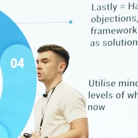
Paddy McLarnon founded PM Digital and has been a name in CRO for the last four years. He takes the first call with every brand himself, and stays close to the strategy. He has spoken at DTC Growth Summit in Miami and New York, and hosts the Funnel First podcast.
Meet the agency
Our team
The in-house team behind the work.
Your pod does the work, and the whole team backs it. Plus you, in a dedicated Slack channel with all of them.


