The tests
Six wins. The three biggest, up close.
Win 1 · PDP · Subscription selector
Make the subscription saving impossible to miss
The problem: customers were being asked to understand the subscription saving without always seeing the actual price difference clearly. The original buy box led with a per-serving price, a toggle and a list of terms. What we tested: showing the one-time price alongside the discounted subscription price, so the monetary saving is visible at the buying decision. The offer, the delivery cadence and "pause or cancel anytime" sit in one line under the price.
The winning variation set the pattern for how subscription savings are shown everywhere in the funnel: the price you would pay, the price you pay, and the gap between them.
Before · V1
After · V2 winner
Win 2 · Offer · Subscription take rate
Restructure the offer so more first orders are subscriptions
We tested different subscription offer structures and how pricing was presented: the size of the first-order discount, how the monthly price was framed, and what sat next to the button. One experiment increased subscription order share from 89.5% to 96.7%, at 97% reported confidence. Subscribers acquired per visitor also rose from 4.10% to 5.01%, although that secondary result had lower statistical confidence.
89.5% → 96.7%
Subscription order share · 97% confidence
4.10% → 5.01%
Subscribers per visitor · lower confidence
When the subscription is already the default, the remaining lift comes from the framing of the deal, not the discount itself.
Winning structure · Elevate PDP
Win 3 · Cart · Pricing breakdown
Make the cart easier to understand
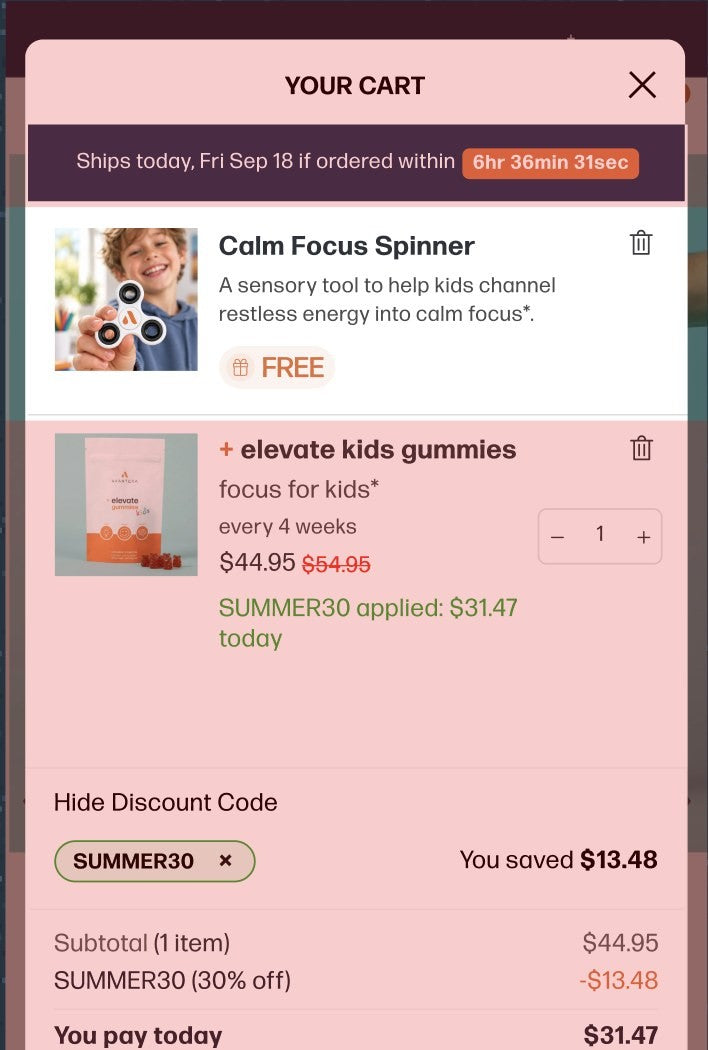
The problem: the original cart did not clearly break down the discount, savings and final price. A customer who had just been promised 30% off could not see it applied. What we changed: a clear pricing breakdown, original price, discount code applied, amount saved, and "you pay today". Free shipping and the free gift are itemised rather than implied, and a ships-today countdown sits at the top.
A discount the customer cannot see being applied is a discount they do not trust. Show the maths.
After · winning cart
Win 4 · PDP · Reassurance
Reduce hesitation at the buy box
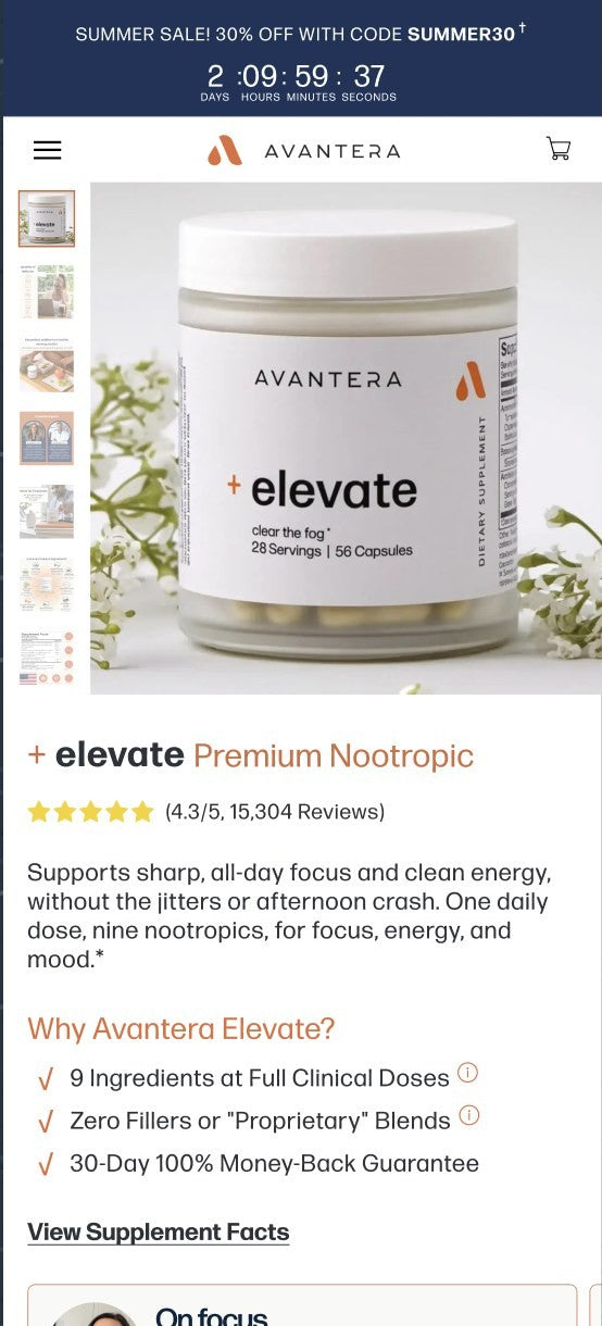
We made purchase reassurance (guarantee, shipping, made in USA, third-party tested) visible right around the buying decision instead of further down the page.
Estimated monthly impact among new customers. Sample: 11,589 visitors, 1,122 orders.
Win 5 · Copy · Hero & reviews
Test how customers understand the product
We tested hero messaging ("clear the fog" vs "clean energy" vs "focus"), which customer reviews to lead with (on focus, on energy, on mood), and the supporting product copy, to learn which benefits deserve the most attention and how to back up the first message further down the page.
Informed the structure of the buying argument across Elevate's product pages.
Win 6 · Offer · Free gift
Improve offer value without a deeper discount
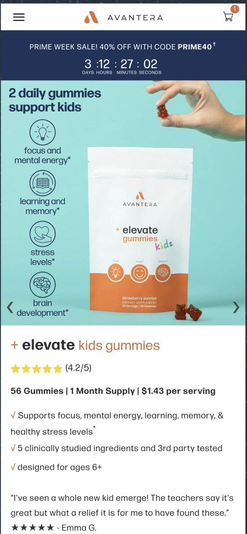
Not every improvement to an offer needs to come from a bigger discount. We tested adding a free gift (a travel pill case on Elevate, a Calm Focus Spinner on the kids gummies) to see whether perceived value would move purchasing behaviour. The gift carried through to the cart as a line item marked FREE.
Offers · Modals & popups
Raise order value at the moment of commitment
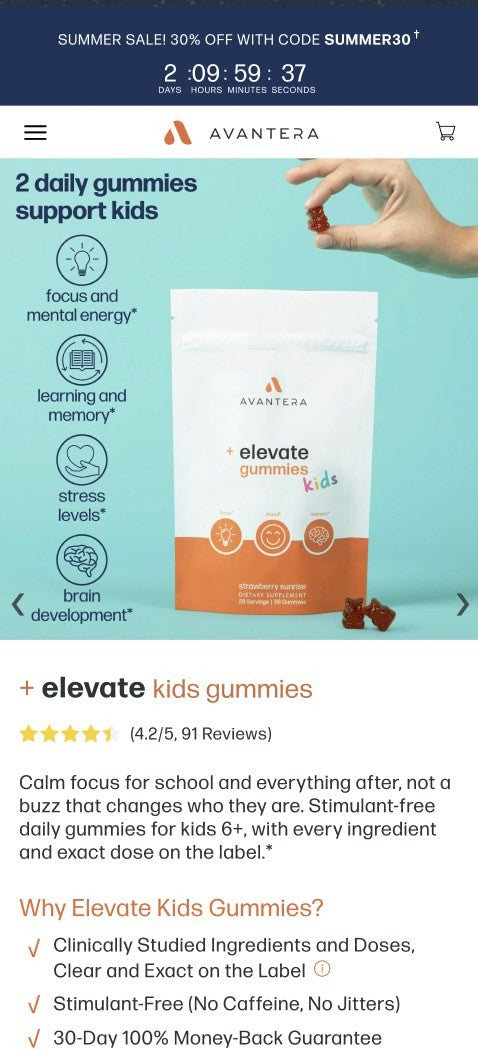
Alongside the on-page tests we designed and built the offer layer that sits over the funnel: a post-add-to-cart bundle upgrade (Elevate + Unwind, designed to work together, 20% off and under $40 a bottle), sitewide sale bars with countdowns (Presidents Day, Spring, Summer, Fall, Prime Week), free gift mechanics and discount code handling in the cart. Each one follows the same rule as the tests: show the current order, show the upgrade, show the saving in money, and make "continue with my order" easy to find so the modal never feels like a trap.
Post-add bundle upgrade · Elevate + Unwind

Landing pages · 1.79M sessions
1.79 million sessions to one landing page
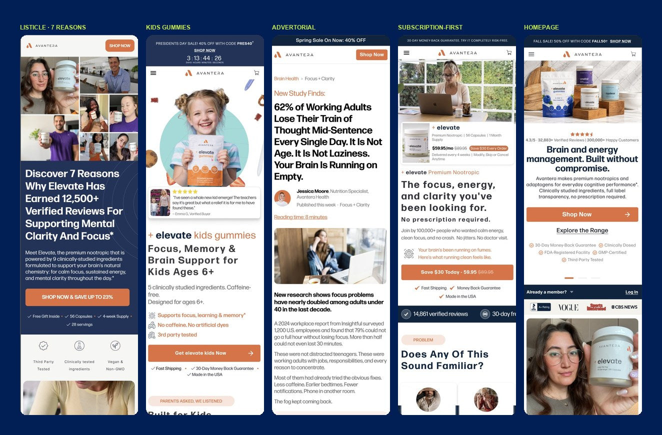
Alongside A/B testing, we built and optimised dedicated landing pages for Avantera's different acquisition angles: education-led pages, subscription-focused funnels, advertorials, a kids-specific page and the homepage. One key landing page received approximately 1.79 million sessions at a reported 2.2% conversion rate. At that volume, small improvements in conversion or profit per visitor carry substantial commercial value.
Landing pages by angle: listicle, kids, advertorial, subscription-first, homepage