
Case Studies › Curious Elixirs

How one product gallery test lifted Curious Elixirs' conversion rate by 35%

× PMDIGITAL
DESIGN
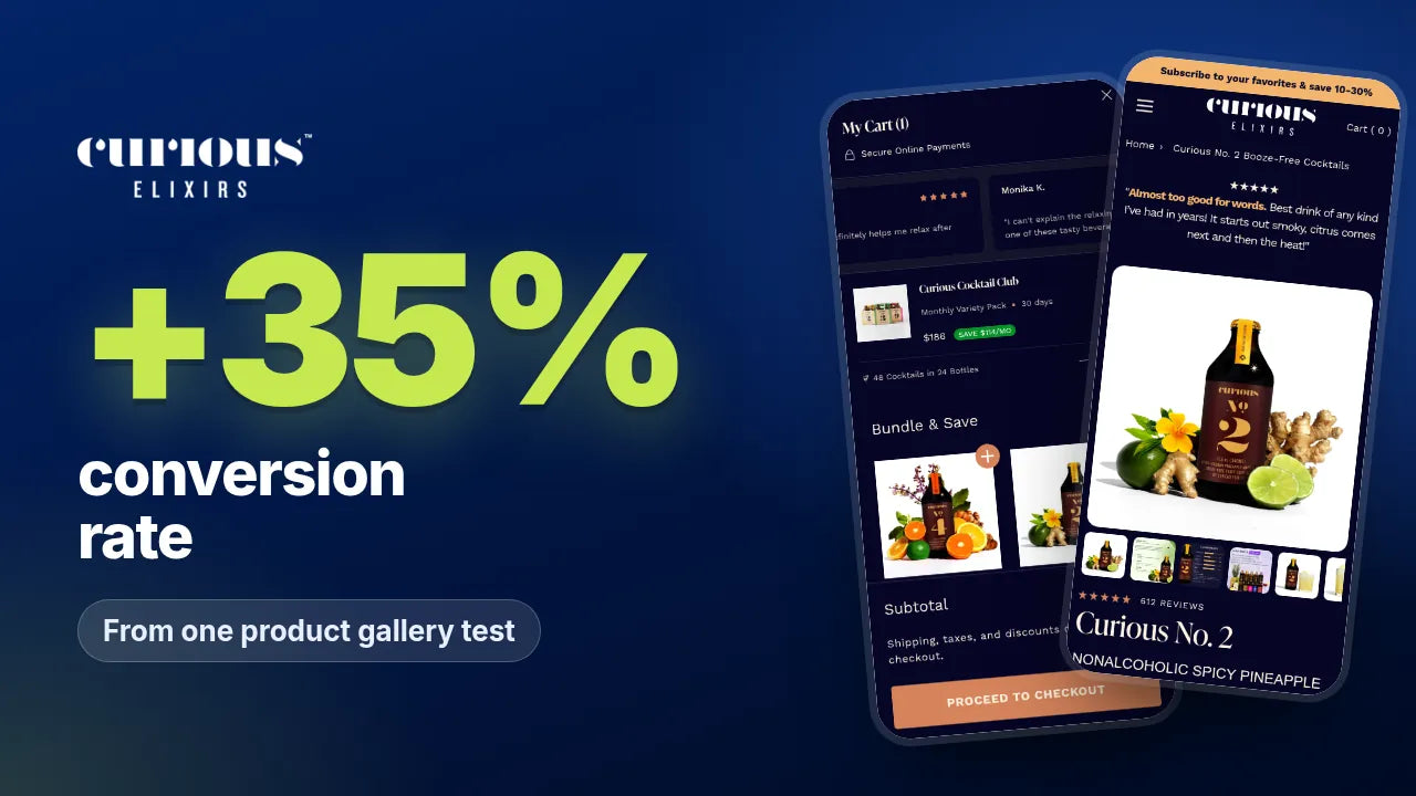
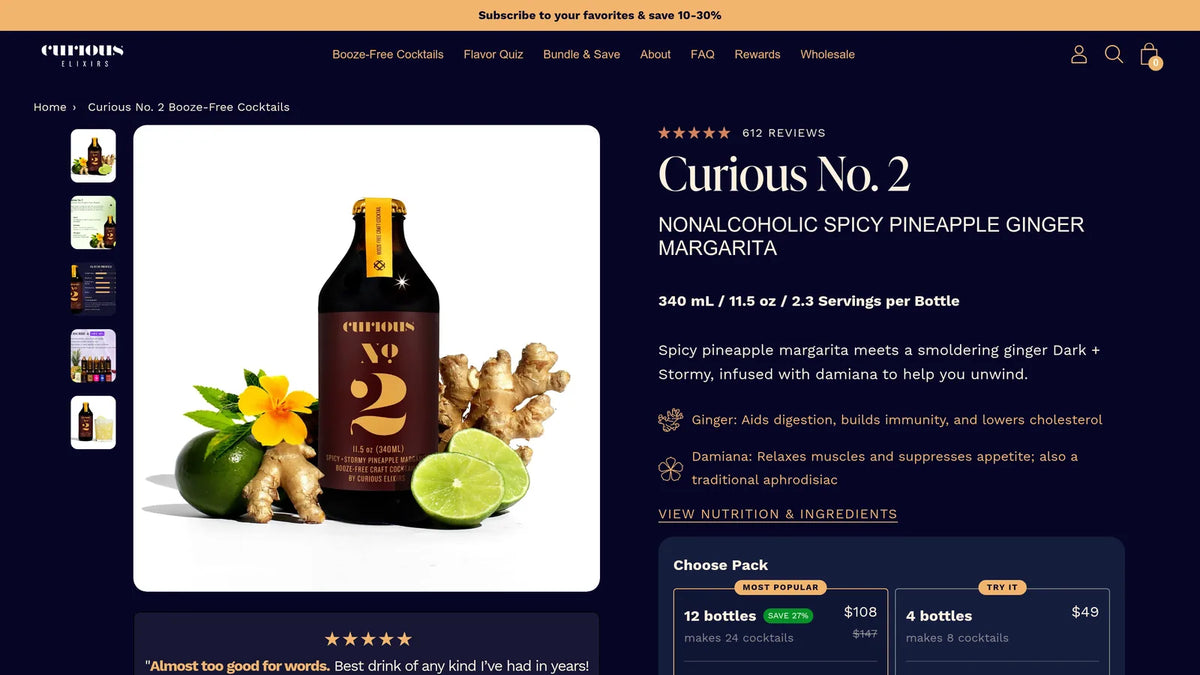
Curious Elixirs result card: +35% conversion rate from one product gallery test, shown on the product page and cart
+35%
Conversion rate, product gallery test
+30%
Revenue per visitor, same test
+12%
Revenue per visitor, cart reviews test
curiouselixirs.com/products/curious-no-2-cocktails
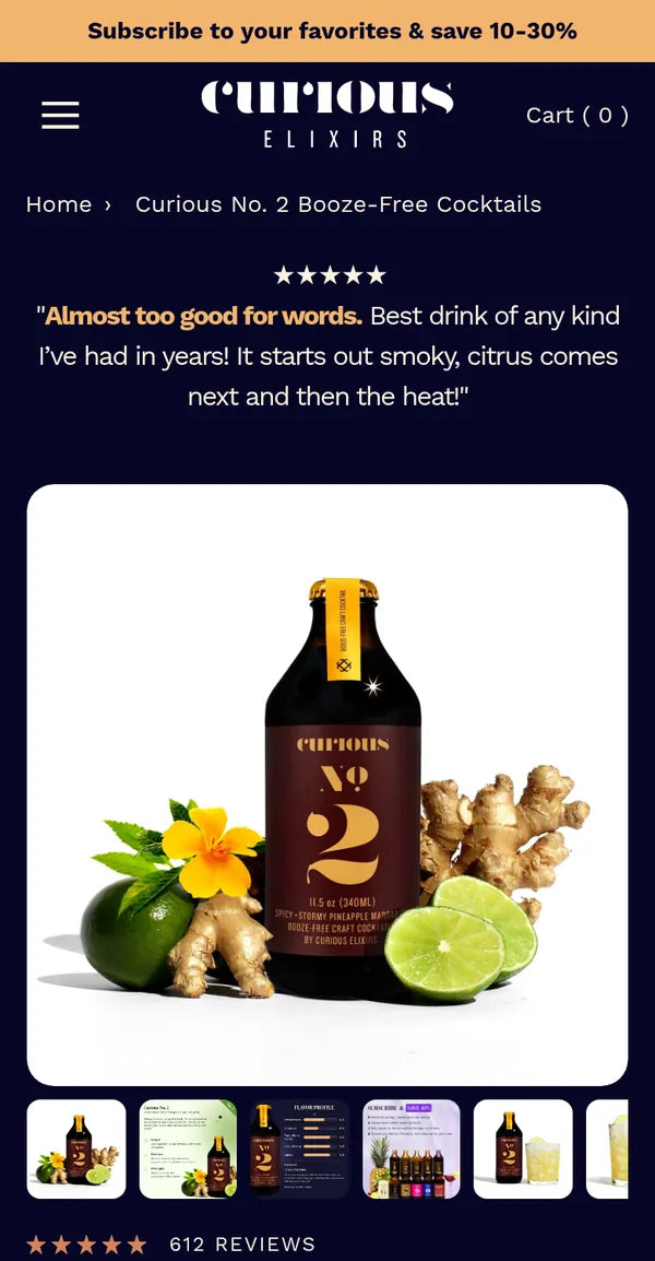
Curious Elixirs mobileCurious Elixirs optimised page
Client
Curious Elixirs
Industry
Booze-free craft cocktails
Platform
Shopify · Intelligems
Engagement
Ongoing CRO partnership
The challenge

Shoppers wanted to know how it tastes and how it makes them feel.

The product image gallery was the most-clicked element on product pages, yet it only showed styled product photography. To learn what a drink tastes like, what is in it and how it makes you feel, shoppers had to scroll below the fold or open the FAQs. For a new category with functional ingredients, that is the question that decides the sale.

  1. 01Friction point

    Gallery did not educate

    The most-clicked element only showed product photography.

  2. 02Friction point

    Answers below the fold

    Taste, ingredients and effects sat in copy and FAQs.

  3. 03Friction point

    Little reassurance in cart

    Shoppers reached the cart without fresh social proof.

What the research told us

The answers were in the wrong place.

  1. FAQ click data
    • What we foundThe two most-clicked FAQ questions were both about how the drinks make you feel, with 177 and 173 clicks.
    • What we didPut effects, ingredients and taste inside the product gallery.
  2. Behavioural data
    • What we foundThe product image gallery was the most-clicked element on product pages.
    • What we didMade the gallery the place shoppers learn what they are buying.
The strategy

Answer the buying question where shoppers already look.

We moved the answers to the places with the most attention: the product gallery, the cart and the collection filters. Each change ran as an A/B test with revenue per visitor as the primary metric.

Where we worked in the funnel
  1. 1CollectionWin 3
  2. 2Product pageWin 1
  3. 3CartWin 2
  4. 4SubscriptionCocktail Club offers
  • How we worked
  • Customer research
  • Product page
  • Cart
  • Collection
  • A/B testing
The tests

Three winners, one principle.

1Product page · Image gallery

Turn the gallery into the sales pitch

We redesigned the gallery so every slide does a job: ingredient callouts with their benefits, a flavour profile, a verified customer review and the subscription benefits. The highest-attention surface on the page became the place shoppers learn what they are buying.

+35%Conversion rate · 100% confidence
+30%Revenue per visitor · 98% confidence
+7%Add to cart rate
+46%Mobile revenue per visitor
  • Why it wonNew visitors (+32% revenue per visitor) and returning visitors (+25%) both improved, the first change on the account to lift both. Mobile did the heavy lifting, because mobile shoppers swipe the gallery rather than scroll.
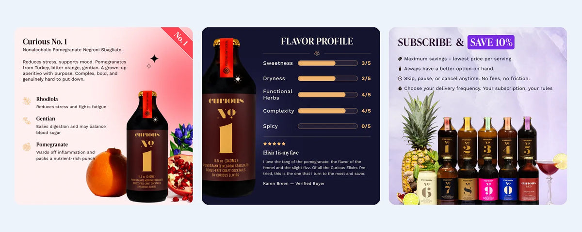
Winning gallery slides · ingredients, flavour profile, subscription
Curious Elixirs value-led product gallery slides: ingredients, flavour profile and subscription benefits

Projected at the end of the test: about 446 extra orders and $51,053 extra revenue a month. A projection, not realised revenue.
2Cart · Reviews

Put reviews where shoppers commit

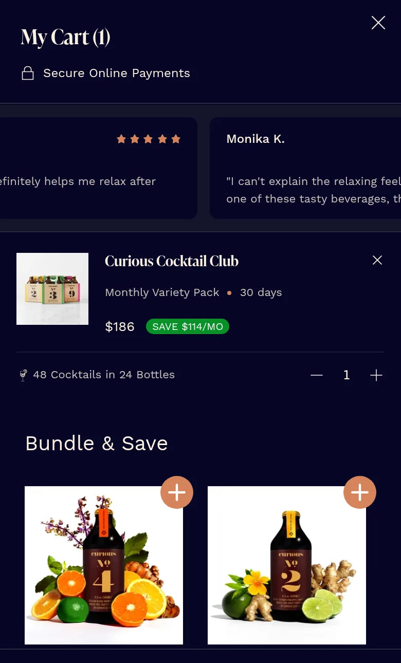
We tested customer reviews in the cart drawer. The winning variant placed them at the top, next to the cart threshold bar, so shoppers see social proof at the moment they decide to check out.

+12%Revenue per visitor
+18%Conversion rate
+26%New visitor revenue per visitor
  • Why it wonReassurance works best at the point of commitment, especially for first-time buyers.
Live today · reviews at the top of the cart
Curious Elixirs cart drawer with customer reviews at the top
3Collection · Filters

Surface the most-used filters

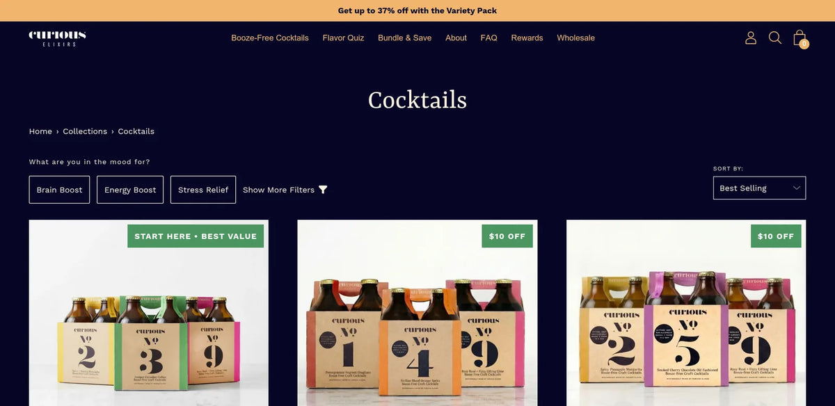
We moved the most-used filters out of the filter drawer and into a row above the products, so shoppers can narrow the range in one tap.

WinnerAcross all visitor segments
  • Why it wonHelping shoppers find their flavour faster pays off on every device.
Live today · inline filters on the cocktails collection
Curious Elixirs cocktails collection page with inline filters
Beyond the tests · Design and build

The rest of the programme

Alongside the A/B tests we designed and built a homepage redesign, product page redesigns, a Red Wine landing page, a bundle builder and subscription offer work for the Cocktail Club.

Why it won

What made the difference, section by section.

  1. 1Product page · Image gallery

    Turn the gallery into the sales pitch

    New visitors (+32% revenue per visitor) and returning visitors (+25%) both improved, the first change on the account to lift both. Mobile did the heavy lifting, because mobile shoppers swipe the gallery rather than scroll.

    +35%Conversion rate · 100% confidence
  2. 2Cart · Reviews

    Put reviews where shoppers commit

    Reassurance works best at the point of commitment, especially for first-time buyers.

    +12%Revenue per visitor
  3. 3Collection · Filters

    Surface the most-used filters

    Helping shoppers find their flavour faster pays off on every device.

    WinnerAcross all visitor segments
Honest accounting

Not every test won. That is the point.

A simplified cart performed at parity with the original. A "how it makes you feel" comparison pop-up showed no significant change. An earlier gallery carousel placement cut conversion among returning visitors, and that result shaped the winning gallery.

  1. Parity

    Simplified cart

    A stripped-back cart drawer performed at parity with the original, so the original stayed.

  2. No significant change

    "How it makes you feel" comparison pop-up

    A pop-up explaining how each drink makes you feel showed no significant change, so the gallery became the place for that message instead.

The bigger result

More buyers, and more revenue from each visitor.

+35%Conversion rateGallery test, 100% confidence
+30%Revenue per visitorGallery test, 98% confidence
+18%Conversion rateCart reviews test
Implementation status

The value-led gallery was rolled out and is live on product pages. The cart reviews winner was rolled out to all visitors and moved into permanent development.

Keep reading

See how we work

Want the method behind these results? See how our Shopify CRO agency runs a testing programme, read our guide to Shopify subscription optimisation and our Shopify CRO audit framework, or browse more case studies. New to us? Start at the PM Digital homepage.

Work with us

How much more could your traffic be worth?

We will review your product pages, cart and collections, then show you the first three tests we would run.