
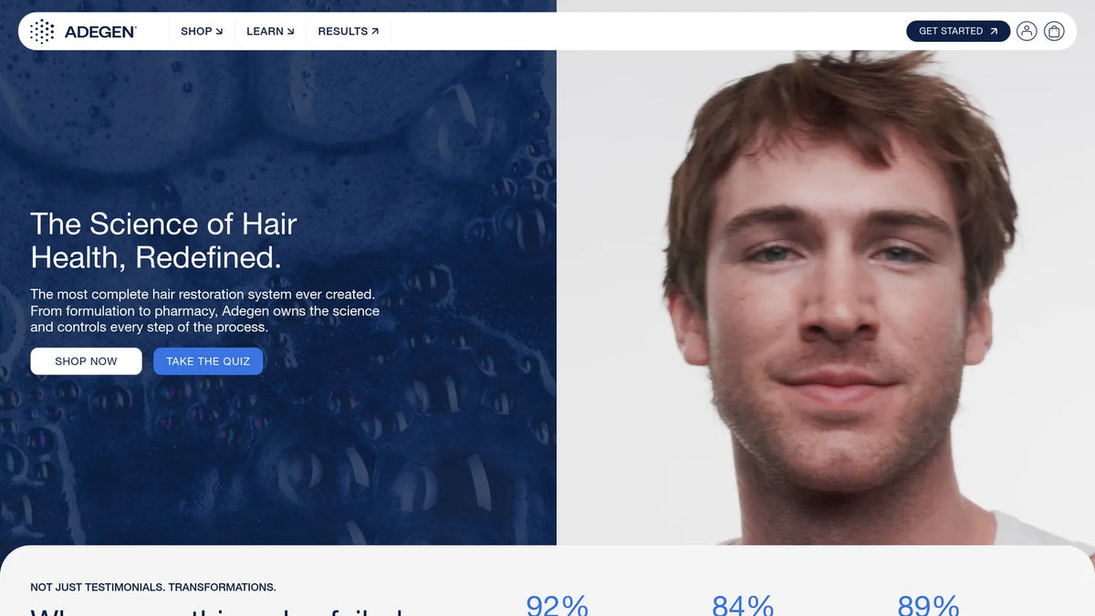
Case Studies › Adegen

How one offer test lifted Adegen's revenue per visitor by 32%

× PMDIGITAL
DESIGN
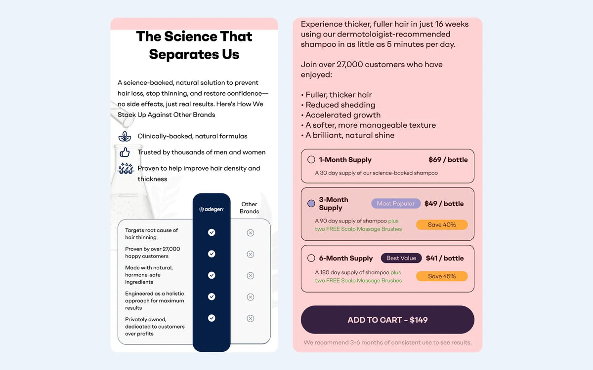
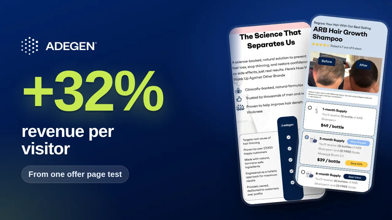
Adegen result card: +32% revenue per visitor, $6.50 to $8.60 from one offer page test, shown on two mobile screens of the winning page
+32%
Revenue per visitor, one offer page test
+19%
Conversion rate, 5.6% to 6.7%, same offer test
+40%
Mobile product page conversion rate, 6.4% to 9.0%
adegen.com
Adegen mobileAdegen optimised page
Client
Adegen
Industry
Hair health
Platform
Shopify · Intelligems
Engagement
CRO testing programme
The challenge

Cold traffic, a considered purchase, and the offer sat too far down the page.

Adegen's buyers arrive from paid social, often after trying other hair loss products. The offer page opened with a headline and one button, so visitors scrolled a long way before they saw proof, pricing or what makes the formula different. On mobile, the product page buy box mixed package, formula and subscription choices in a way that was hard to scan.

  1. 01Friction point

    Offer seen too late

    Pricing and supply options sat far below the fold.

  2. 02Friction point

    Proof not upfront

    Before and after results were buried in the page.

  3. 03Friction point

    Unclear difference

    Visitors could not see why the formula was different.

  4. 04Friction point

    Busy mobile buy box

    Package, formula and subscription choices competed.

The strategy

Put the offer, the proof and the difference in the first scroll.

Each test answered one question a cold visitor asks before buying: what does it cost, does it work, and why this one? Every change ran as a split test with revenue per visitor as the main metric, so a higher conversion rate could never hide a lower order value.

Where we worked in the funnel
  1. 1Ads to offer pageWin 1
  2. 2NavigationWin 3
  3. 3Product pageWin 2
  4. 4CartCart upsell winner
  • How we worked
  • Offer
  • Proof
  • Positioning
  • Buy box
  • Navigation
The tests

Three winners, up close.

1Offer page · Hero

Lead with the offer, the proof and the comparison

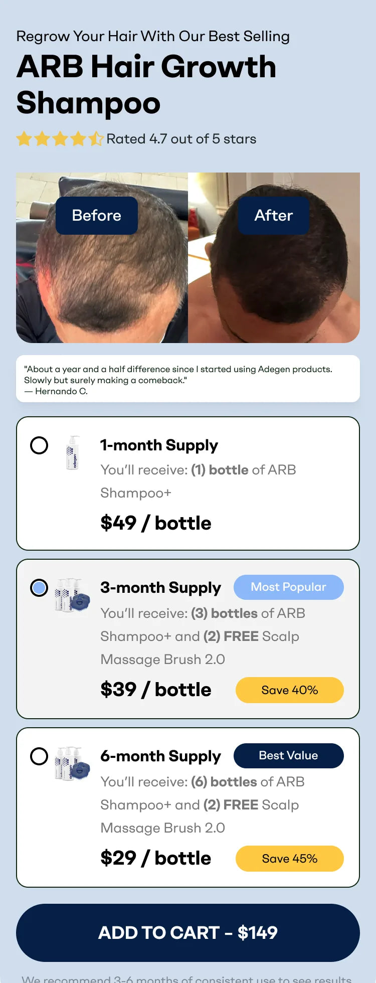
The control hero led with a headline, three benefit ticks and one button. The winning variant put a before and after photo, a customer quote and 1, 3 and 6 month supply tiles in the first screen, each showing the price per bottle and the saving. Further down, a comparison with generic alternatives showed what makes the formula different. The test ran for 21 days.

$6.50 → $8.60Revenue per visitor · 95% confidence
5.6% → 6.7%Conversion rate
$116 → $129Average order value
$4.50 → $5.80Profit per visitor
  • Why it wonCold visitors decide fast. When the price, the saving and the proof sit together in the first screen, more of them buy, and more of them choose a bigger bundle.
Control · hero
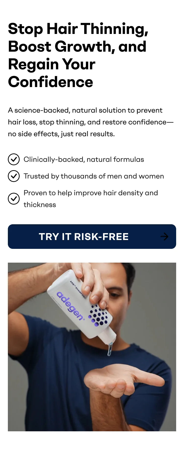
Adegen shampoo offer page hero on mobile, control version
Variant 1 · winner
Adegen shampoo offer page hero on mobile with 1, 3 and 6 month offer tiles, winning version
Winner, further down · comparison and supply options
Adegen shampoo page comparison with generic alternatives and supply options buy box
2Mobile product page · Buy box

Make the buy box easy to scan on mobile

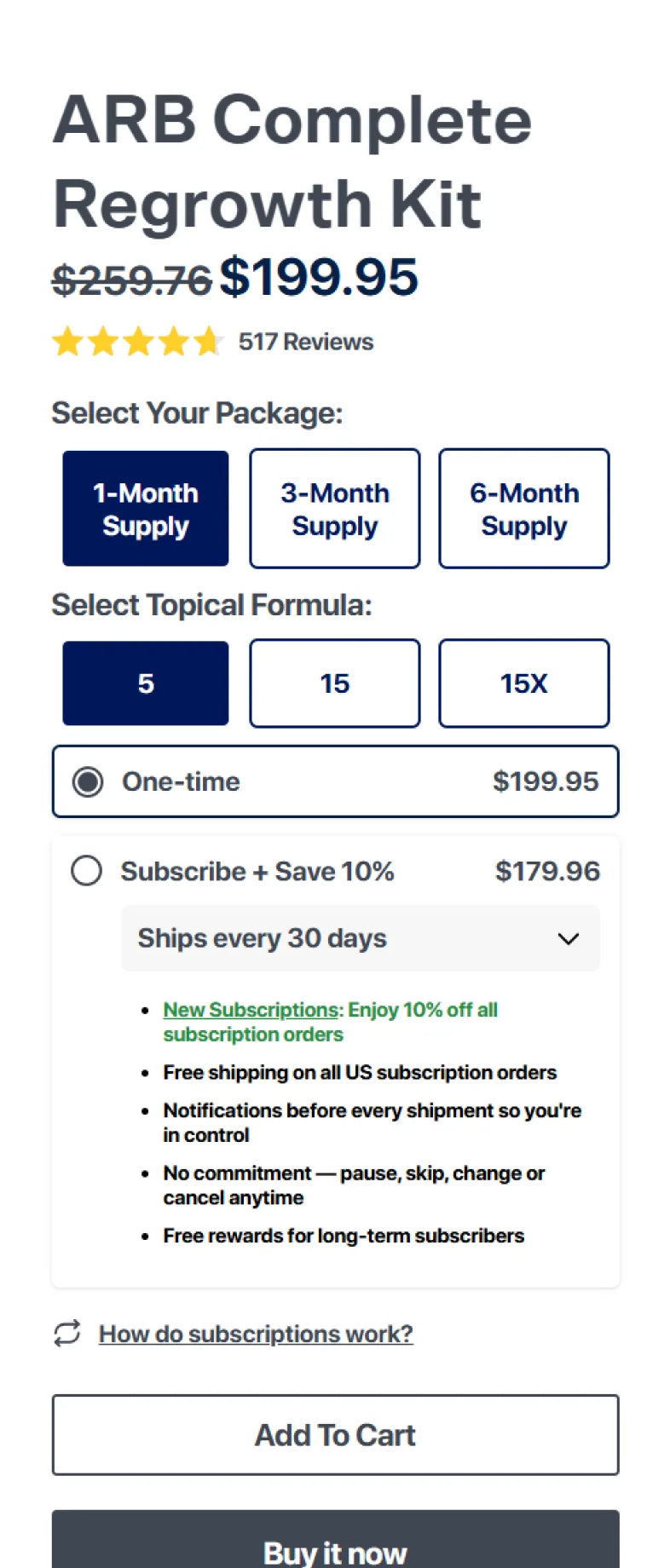
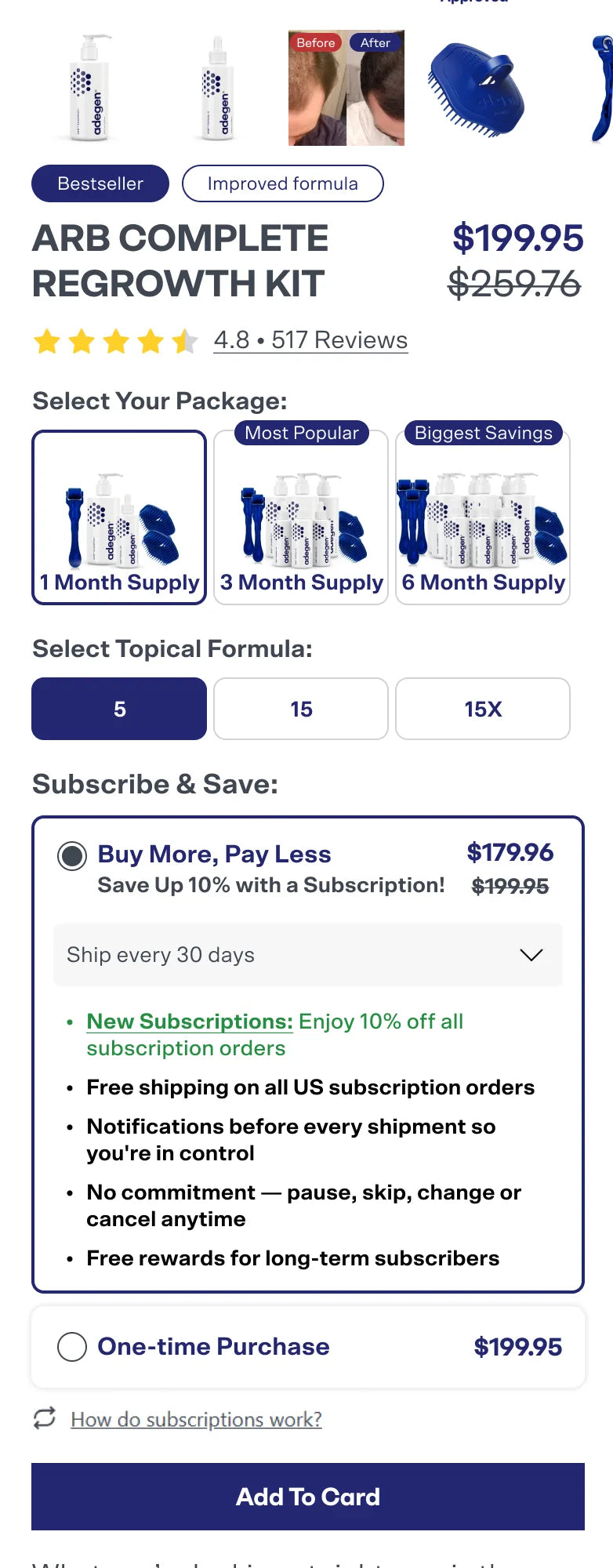
On the regrowth kit page, the original buy box used text buttons for packages and listed the subscription terms as a block. The winning version shows product images on each package, flags the most popular and biggest saving options, and leads the subscription choice with "Buy more, pay less" and the saving.

6.4% → 9.0%Mobile conversion rate
$16.40 → $25.20Revenue per visitor
97%Probability to beat control
1,634Sessions in test
  • Why it wonVisual package options and a clear saving make a buy box with several choices feel simple.
Control · buy box
Adegen regrowth kit mobile product page buy box before the test
Variant · winner
Adegen regrowth kit mobile product page with restructured package and subscription buy box
3Navigation · Menu

Turn the menu into a shop window

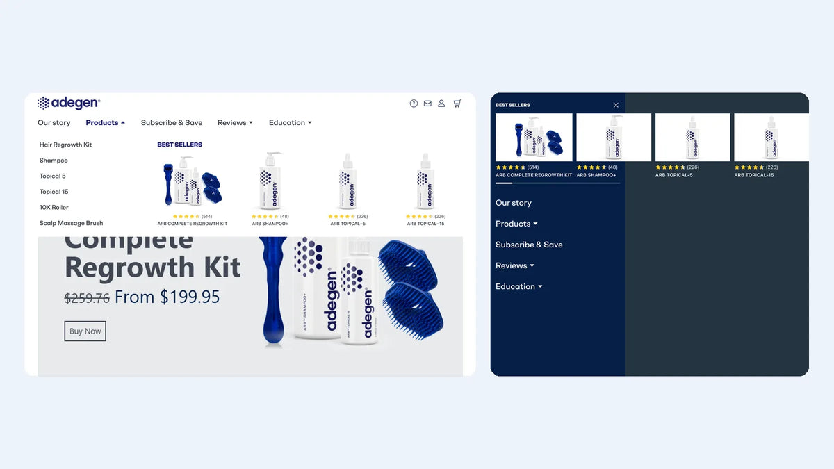
We restructured the menu so best sellers appear with images, star ratings and review counts as soon as it opens, on desktop and mobile.

2.9% → 3.1%Conversion rate
$6.80 → $7.00Revenue per visitor
18,593Sessions in test
  • Why it wonNavigation is a sales surface. Products with social proof sell better than a list of links.
Winning menu · desktop and mobile
Adegen restructured navigation menu with best sellers, desktop and mobile
Why it won

What made the difference, section by section.

  1. 1Offer page · Hero

    Lead with the offer, the proof and the comparison

    Cold visitors decide fast. When the price, the saving and the proof sit together in the first screen, more of them buy, and more of them choose a bigger bundle.

    $6.50 → $8.60Revenue per visitor · 95% confidence
  2. 2Mobile product page · Buy box

    Make the buy box easy to scan on mobile

    Visual package options and a clear saving make a buy box with several choices feel simple.

    6.4% → 9.0%Mobile conversion rate
  3. 3Navigation · Menu

    Turn the menu into a shop window

    Navigation is a sales surface. Products with social proof sell better than a list of links.

    2.9% → 3.1%Conversion rate
Honest accounting

Not every test won. That is the point.

Four of the ten completed tests won. The losers were just as useful. One offer test lifted average order value by 8% but cut conversion rate by 9%, so it lost on revenue per visitor. An image-only change did not move cold traffic at all.

10Tests run
4Winners
6Flat or negative, documented
  1. Higher AOV, lower revenue

    Bigger orders, fewer buyers

    Average order value rose 8% but conversion rate fell 9%, so revenue per visitor fell.

  2. Did not move the needle

    Image-only change

    Swapping imagery alone did not change how cold traffic behaved.

The bigger result

More buyers, bigger orders, same traffic.

The offer page winner improved every commercial metric we track at once. New visitors saw revenue per visitor rise 35% and conversion rate rise 20%.

+32%Revenue per visitorOffer page test, 95% confidence
+19%Conversion rateOffer page test
+11%Average order valueOffer page test
+30%Profit per visitorOffer page test
Keep reading

See how we work

Want the method behind these results? See how our Shopify CRO agency runs a testing programme, read our guide to Shopify subscription optimisation and our cold traffic landing page framework, or browse more case studies. New to us? Start at the PM Digital homepage.

Work with us

How much more could your traffic be worth?

We will review your offer pages, product pages and buy box, then show you the first three tests we would run.