

Case Studies › Tales

How one homepage test lifted Tales' conversion rate by 29%

× PMDIGITAL
DESIGN
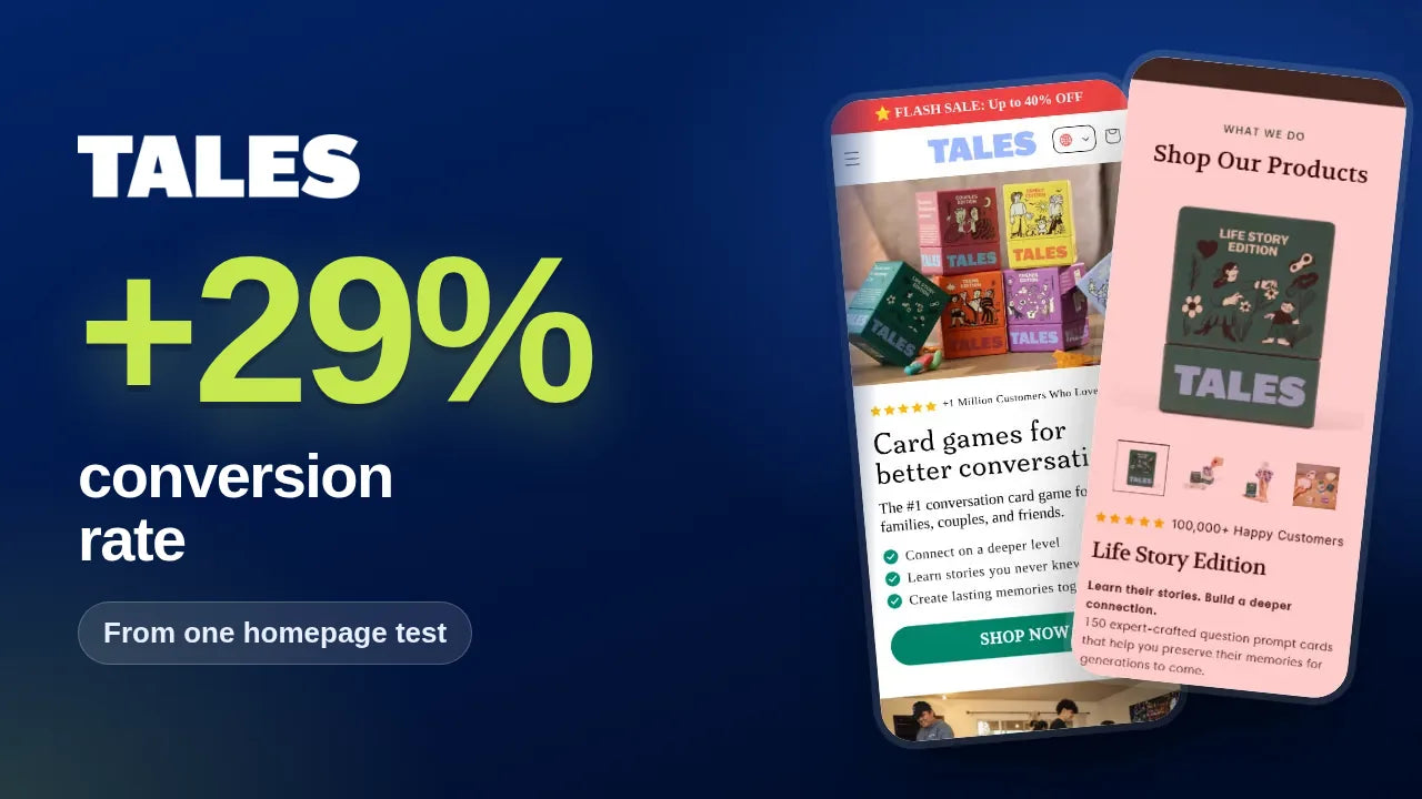
Tales result card: +29% conversion rate from one homepage test, shown on two mobile screens
+29%
Conversion rate, one homepage test
+32%
Revenue per visitor, $4.50 to $5.90
8.3% → 10.6%
Conversion rate, before and after
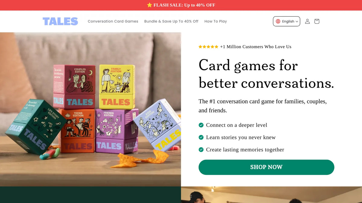
tales.com
Tales mobileTales optimised page
Client
Tales
Industry
Card games and gifts
Platform
Shopify · Intelligems
Engagement
Two month CRO engagement
The challenge

Great products, hard to compare.

Tales sells several editions for different relationships. The homepage made shoppers work to compare them, the multi-buy discount was not visible where they chose, and common questions about shipping, digital versions and gifting had no clear answer on the page.

  1. 01Friction point

    Hard to compare

    Editions were not shown side by side.

  2. 02Friction point

    Discount hidden

    The multi-buy saving was not shown where shoppers chose.

  3. 03Friction point

    Open questions

    Shipping, digital versions and gifting were not answered.

The strategy

Make the choice easy and the deal obvious.

We redesigned the homepage product section and tested it against the original for two weeks, with conversion rate, average order value and revenue per visitor as the metrics.

  • How we worked
  • Homepage
  • Offer
  • FAQ
  • A/B testing
The tests

The winner, section by section.

1Homepage · Product section

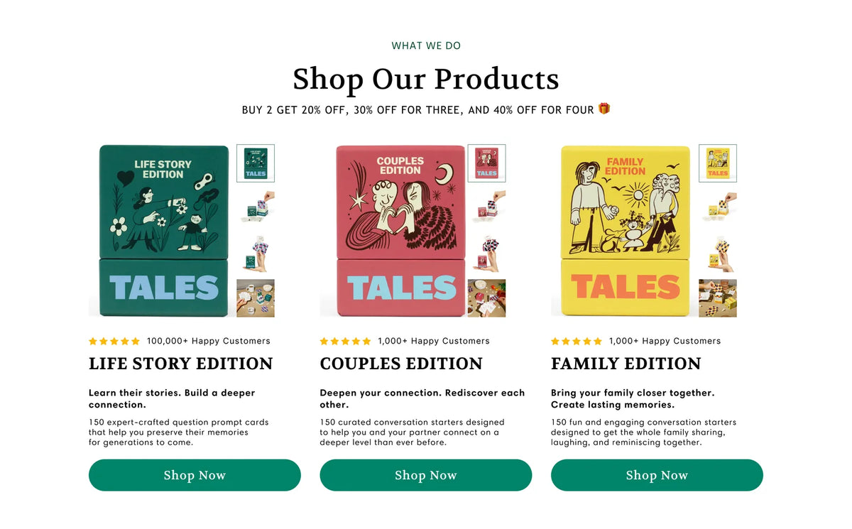
Show every edition side by side, with the deal on top

The winning design shows the Life Story, Couples and Family editions side by side, each with its rating, who it is for and a Shop Now button. One line above states the multi-buy discount: 20% off two, 30% off three and 40% off four.

8.3% → 10.6%Conversion rate · p < 0.05
$4.50 → $5.90Revenue per visitor
3,676Visitors over two weeks
  • Why it wonWhen shoppers can compare the options and see the saving at a glance, more of them buy.
Winning design · mobile

Tales redesigned homepage product section on mobile
Winning design · homepage product section, desktop
Tales redesigned homepage product section with tiered discount line, desktop
Homepage · FAQ

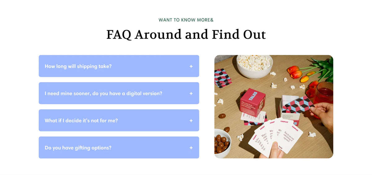
Answer the last questions before they become objections

Part of the same winning variant: an FAQ block under the products answering shipping times, digital versions, returns and gifting.

Winning design · FAQ section
Tales homepage FAQ section design
Honest accounting

Not every test won. That is the point.

Tiered pricing on the product page, bundle positioning in the cart and a sticky add to cart button on mobile did not beat their controls. An advertorial redirect raised revenue per visitor by 5% but cut conversion rate by 3%, so it was not a clear win.

  1. Did not beat control

    Tiered pricing on the product page

    Showing tiered pricing in the product page buy box did not win.

  2. Mixed result

    Advertorial redirect

    Revenue per visitor up 5%, conversion rate down 3%.

The bigger result

More buyers from the same homepage traffic.

The winning variant beat the control on conversion rate, revenue and average order value. The improvement in conversion rate was statistically significant (p < 0.05).

MetricBeforeAfter
Conversion rate8.3%10.6%
Revenue per visitor$4.50$5.90
Visitors1,8181,858
Implementation status

The winning design was implemented permanently on the homepage.

Keep reading

See how we work

Want the method behind these results? See how our Shopify CRO agency runs a testing programme, read our guide to Shopify subscription optimisation and how long to run an A/B test, or browse more case studies. New to us? Start at the PM Digital homepage.

Work with us

How much more could your traffic be worth?

We will review your homepage, offer and product pages, then show you the first three tests we would run.