Case Studies › The Cornish Seaweed Bath Co

How we lifted The Cornish Seaweed Bath Co's revenue per visitor by 11% and conversion rate by 12%

× PMDIGITAL
DESIGN
+11%
Revenue per visitor from the homepage redesign
+12%
Conversion rate from the homepage redesign
+9%
Revenue per visitor from fewer bundles on the haircare collection
cornishseaweedbath.co.uk
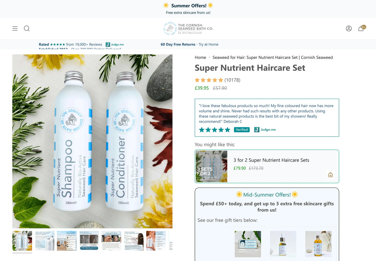
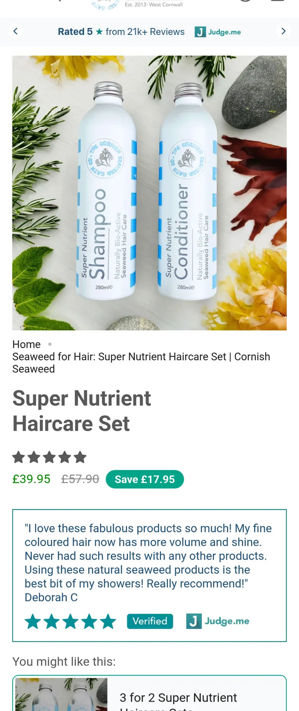
Super Nutrient Haircare Set product page on mobile with the Save £17.95 badgeThe Cornish Seaweed Bath Co homepage buy box for the Super Nutrient Haircare Set, added in the winning homepage redesign
Client
The Cornish Seaweed Bath Co
Industry
Natural haircare and skincare
Platform
Shopify · Intelligems
Engagement
CRO & Scale Plan, December 2025 to present
The challenge

A homepage built like a catalogue, for visitors who did not know the brand yet.

Most new visitors arrived from Meta ads with a hair or scalp problem and no idea who the brand was. The homepage opened with products, press logos and reviews before it explained why seaweed, or who makes it. On the product page, the saving on the best selling set was only implied by a crossed out price. The products were good value. The pages were not showing it.

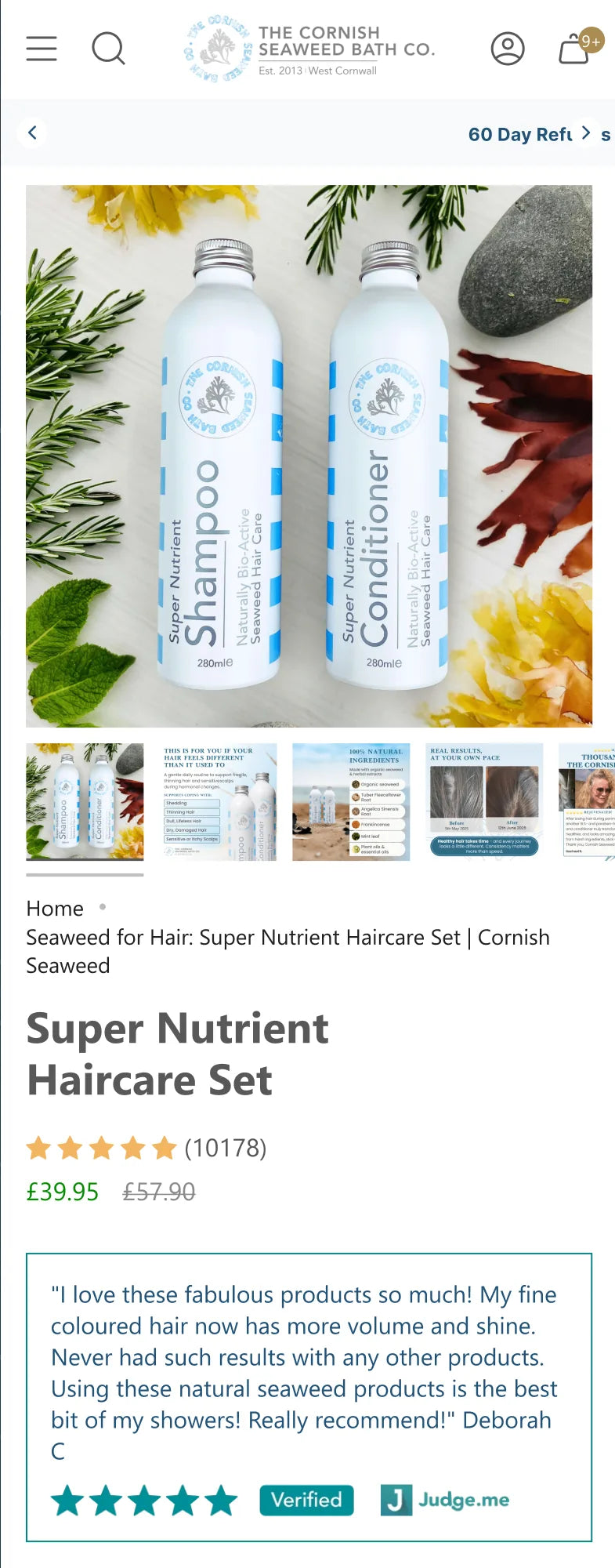
Before · product page, the saving left for the shopper to work out
Super Nutrient Haircare Set product page on mobile before the savings badge test
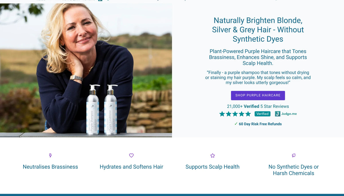
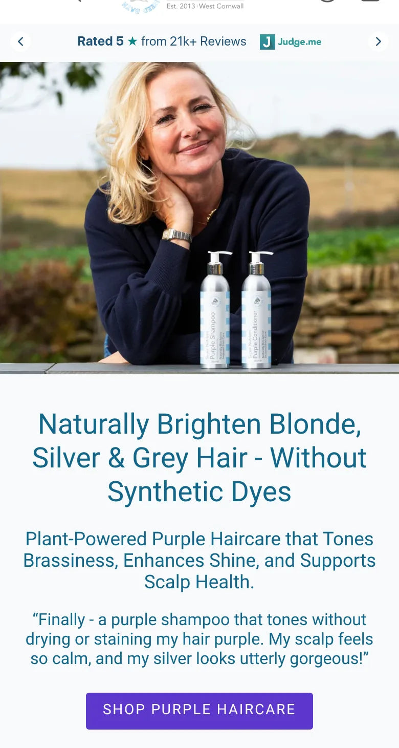
Purple haircare page, one of the pages used in the copy test
Purple haircare landing page hero on mobile, the page used in the sentence case copy test
  1. 01Friction point

    Who are these people?

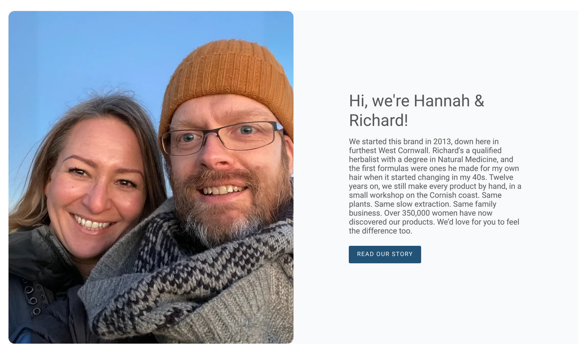
    The founder story sat below products, press logos and reviews.

  2. 02Friction point

    Why would seaweed work when other natural products did not?

    The mechanism was never explained on the homepage.

  3. 03Friction point

    Which product is right for my hair?

    32% of survey respondents named fit uncertainty as a main obstacle.

  4. 04Friction point

    Is it worth the price?

    The saving on the best selling set was only implied by a crossed out price.

The research

What the customers told us.

January 2026 was research only. We built a customer persona audit from 90 days of funnel data, the post purchase survey and the words customers use. It showed the biggest leak came before the cart, with only 11.4% of visitors adding to cart, that 85% of traffic was on mobile, and that shoppers were not confused about their problem but about where to start and what to expect. The post purchase survey, with more than 15,000 responses, keeps feeding the roadmap.

  1. Post purchase survey
    • What we foundPrice was the most named barrier to buying, yet only 6 of 15,484 respondents said the product was too expensive for what they got.
    • What we didThis is a value legibility problem, not a pricing problem. Show the saving clearly.
  2. Post purchase survey
    • What we found32% named uncertainty about which product suits them as a main obstacle.
    • What we didRoute undecided visitors to the right set instead of a generic catalogue.
  3. Audience profile
    • What we foundThe core buyer is aged 45 to 65 and reacts badly to pressure tactics.
    • What we didCopy should read like a person talking, not an advert.
The strategy

Explain first. Sell second. Sound like a person.

The brand's landing pages already converted far better than a standard product page because they educate before they sell. We took the same logic to the homepage: the founder story first, then how seaweed works, then a buy box for the best selling set, then help for anyone unsure which product to choose. Around that we ran three tracks. Subscriptions, built and launched carefully on their own product page. Offers and bundles, simplified so new customers could choose. And landing pages and advertorials for the angles already working in the ads, with every page written to sound like a person, not an advert.

  • The goal was notHow do we push more people to buy?
  • It wasHow do we help the right people trust the brand enough to buy?
Where we worked in the funnel
  1. 1Ads and landing pagesListicles, launches and sale pages
  2. 2Homepage+11% revenue per visitor
  3. 3Collection+9% revenue per visitor
  4. 4Product page+14% new visitor conversion
  5. 5SubscriptionsLive since June 2026
  • How we worked
  • Story
  • Mechanism
  • Value
  • Tone
  • Subscriptions
  • Offers

CRO Brain and PMD Cortex AIThis is our CRO & Scale Plan. A full pod runs it, with strategy, copy, design and QA on every test, and our engineers on dev, managing the bots. Every result, report and survey goes into The Cornish Seaweed Bath Co's CRO Brain, our running record of what their customers respond to, from audience and positioning to funnels and past tests, and PMD Cortex AI, our own AI system, learns from every test we run, so each new test starts from what has already worked.

How the partnership grew

Research first, then a steady run of tests and launches.

  1. December 2025 to January 2026

    Research and the subscription build

    Onboarding, the customer persona audit, and a subscription buy box built from scratch on a copy of the best selling set page, away from the live store.

  2. February to May 2026

    Testing starts

    Bundle, FAQ, product image, savings, cart and navigation tests, and the first landing pages built at pace, including the Hair Thinning listicle.

  3. June to August 2026

    Subscriptions and sale pages

    Subscriptions live for new customers from 1 June, subscription page tests, the Prime Day sale page and more launch pages.

  4. September 2026 to now

    Homepage rebuilt and Black Friday

    The founder led homepage, sentence case copy, sticky add to cart rolled out sitewide, the Curly range launch page and the full Black Friday build.

The work

What we changed, and what each change did.

01 · Homepage · full redesign

Tell them who you are before you sell.

We rebuilt the homepage in the order a new visitor needs it. The founder story comes first, then how seaweed works, then a buy box for the Super Nutrient Haircare Set halfway down the page, then help choosing the right product and a FAQ organised by hair concern. The founder story video sits in the seaweed section.

+11%Revenue per visitor
+12%Conversion rate
  • What changedFounder story first, seaweed mechanism second, a mid page buy box, routing by hair type and a concern led FAQ, in place of a product carousel, press logos and a review slider.
  • HypothesisIf cold visitors understand who makes the products and why they work before seeing the catalogue, more of them will buy.
  • Why it wonCold visitors needed a reason to trust the brand before a reason to buy. The story and the science did that, and the buy box let ready buyers act without leaving the page.
Before · original homepage hero
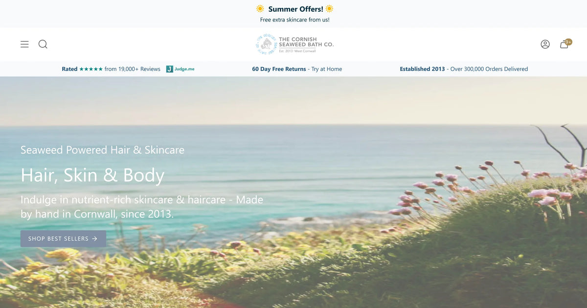
The Cornish Seaweed Bath Co original homepage hero on desktop, before the redesign
After · founder story leads the page
The Cornish Seaweed Bath Co founder story block that now opens the redesigned homepage
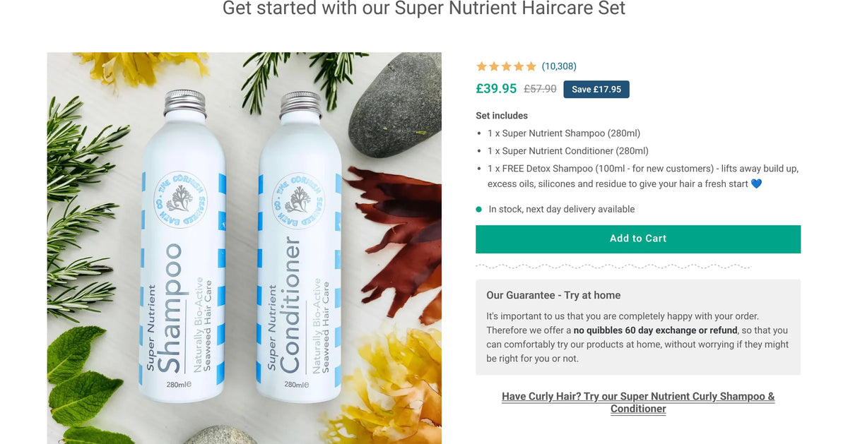
After · buy box for the best selling set, halfway down the homepage
The Cornish Seaweed Bath Co homepage buy box for the Super Nutrient Haircare Set, added in the winning homepage redesign
02 · Collection · fewer bundles

Fewer bundles, easier choices.

The haircare collection was led by the 3 for 2 bundle, which asked a first time visitor for several yeses at once. We cut the number of bundles back so the sets could breathe. Over 14 days, revenue per visitor rose 9% and conversion rate rose 9%, with order value flat. Among new customers, Purple Haircare Set orders rose 60% and Super Nutrient Haircare Set orders rose 34%.

+9%Revenue per visitor
+9%Conversion rate
+60%New customer Purple Haircare Set orders
+34%New customer Super Nutrient Haircare Set orders
  • What changedFewer bundles on the haircare collection, with the 3 for 2 kept but no longer dominating the page.
  • HypothesisIf we cut the bundles and simplify the choice, more visitors will view a product, add to cart and buy, because too many similar options cause decision fatigue.
  • Why it wonA loud bundle has a cost, and the products made for a niche customer pay it. Purple shoppers bought far more once they could see the set made for them.
03 · Product page · image template

Show the detail, and let them read it.

We tested new product image templates on the Super Nutrient Haircare Set page, built to carry more of the detail careful shoppers look for before they buy. New visitor conversion rate rose 14% and paid search conversion rate rose 28%.

+14%New visitor conversion rate
+28%Paid search conversion rate
  • What changedContent rich product image templates in place of the original product images.
  • HypothesisIf the product images explain more of what the product is and what to expect, more new visitors will buy on their first visit.
  • Why it wonVisitors who engage with the detail convert. The images are often the first place they read it.
04 · Product page · FAQ near the buy box

Teach, rather than argue.

We added a FAQ beside the buy box and tested educational answers against answers that handled objections. The educational version won. Revenue per visitor rose 2% and paid search conversion rate rose 5%, and it worked best for new visitors.

+2%Revenue per visitor
+5%Paid search conversion rate
  • What changedA FAQ accordion near the buy box, written to explain rather than to rebut.
  • HypothesisIf the questions people ask before buying are answered where they decide, more of them will buy.
  • Why it wonThis audience wants to understand the product. Explaining worked better than pushing back on doubts.

Projected at around £15,400 a month in extra revenue, based on the test result.

05 · Product pages · sticky add to cart

Keep the button in reach on mobile.

With most traffic on mobile and long product pages, the visitors reading most deeply ended up furthest from the button. We tested a sticky add to cart that appears once the main button scrolls away. It beat the original at 96% probability and was rolled out across the store.

96%Probability to beat the original
  • What changedA sticky add to cart bar on the product pages, shown once the main button is out of view.
  • HypothesisIf the button stays one tap away while people read the reviews and detail, more of them will add to cart and buy.
  • Why it wonThe most interested visitors read the furthest. They should not have to scroll back up to buy.
06 · Landing pages · copy tone

Write like a person, not an advert.

We tested title case headings with capital letter buttons against sentence case headings and buttons across the Purple Haircare and Haircare landing pages.

+6%Revenue per visitor
+4%Conversion rate
  • What changedSentence case headings and buttons in place of title case and capitals.
  • HypothesisIf the copy reads like a real person talking, this audience will trust it more and buy more.
  • Why it wonTitle case and capital letter buttons are the language of promotional retail. For a careful audience that values a founder led brand, the quieter style read as more honest.
Purple haircare page as it runs today, in title case
Purple haircare landing page hero on desktop, the page used in the sentence case copy test
07 · Product page · savings

Show the saving in pounds.

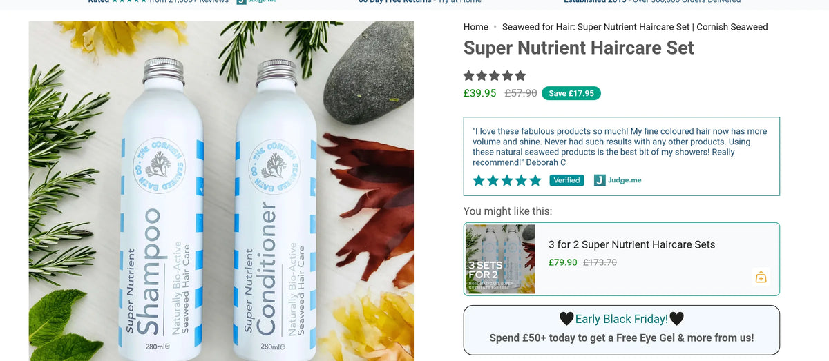
On the Super Nutrient Haircare Set page, the saving was only implied by a crossed out price. We tested explicit saving displays beside the price. The winning version led to the Save £17.95 badge now on the page.

+4%Revenue per visitor
+3%Conversion rate
  • What changedAn explicit saving badge beside the price, in place of a crossed out price on its own.
  • HypothesisIf the value is spelled out at the moment of decision, more people who were hesitating on price will buy.
  • Why it wonCustomers who bought already felt it was worth it. Showing the saving gave hesitant visitors the same reassurance before they bought.
Before · crossed out price only
Super Nutrient Haircare Set product page before the test, showing the crossed out price with no savings badge
After · Save £17.95 beside the price
Super Nutrient Haircare Set product page with the Save £17.95 badge beside the price
08 · Landing pages and offers

Build the pages the ads send people to.

Alongside the tests we built landing pages at pace for the angles already working in the ads: the Hair Thinning Starts at the Scalp listicle, launch pages for the Curly range, the Moisturiser and the hand cream, and the Prime Day sale page. For Black Friday 2026 we built the sale page, a sitewide banner, sale badges, a 48 hour countdown and an email only tiered discount from a single link.

  • What changedDedicated landing pages, listicles and sale pages for each campaign, in place of sending paid traffic to standard product pages.
  • HypothesisIf each campaign lands on a page that continues the ad's story, more of that traffic will buy.
  • Why it wonThe brand's educational pages convert better than standard product pages, so every new campaign gets one.
Why it won

What made the difference, section by section.

Each row links to the test above. The figure is the lead result from the test log.

  1. 101 · Homepage · full redesign

    Tell them who you are before you sell.

    Cold visitors needed a reason to trust the brand before a reason to buy. The story and the science did that, and the buy box let ready buyers act without leaving the page.

    +11%Revenue per visitor
  2. 202 · Collection · fewer bundles

    Fewer bundles, easier choices.

    A loud bundle has a cost, and the products made for a niche customer pay it. Purple shoppers bought far more once they could see the set made for them.

    +9%Revenue per visitor
  3. 303 · Product page · image template

    Show the detail, and let them read it.

    Visitors who engage with the detail convert. The images are often the first place they read it.

    +14%New visitor conversion rate
  4. 404 · Product page · FAQ near the buy box

    Teach, rather than argue.

    This audience wants to understand the product. Explaining worked better than pushing back on doubts.

    +2%Revenue per visitor
  5. 505 · Product pages · sticky add to cart

    Keep the button in reach on mobile.

    The most interested visitors read the furthest. They should not have to scroll back up to buy.

    96%Probability to beat the original
  6. 606 · Landing pages · copy tone

    Write like a person, not an advert.

    Title case and capital letter buttons are the language of promotional retail. For a careful audience that values a founder led brand, the quieter style read as more honest.

    +6%Revenue per visitor
  7. 707 · Product page · savings

    Show the saving in pounds.

    Customers who bought already felt it was worth it. Showing the saving gave hesitant visitors the same reassurance before they bought.

    +4%Revenue per visitor
  8. 808 · Landing pages and offers

    Build the pages the ads send people to.

    The brand's educational pages convert better than standard product pages, so every new campaign gets one.

Honest accounting

Not every test won. That is the point.

We only count a test as a win when the new version beats the original, and the smaller wins here are directional rather than conclusive. One more winner, the award images on the Purple sets, is live on the store, but we are not publishing its figures yet. Subscriptions went live for new customers on 1 June 2026, and those tests are still being worked through. So far the clearest lessons are in the losses below.

  1. Lost

    Crossed out benefits on the one time purchase option

    Revenue per visitor fell 43%. Loss framing felt like pressure to this audience.

  2. Directional

    Hero copy on the old homepage layout

    Revenue per visitor rose 1% and conversion rate 2%, not significant. Better words on the same layout were not enough, which led to the full redesign.

  3. Lost

    Mobile navigation restructure

    Revenue per visitor fell 10% against the original menu, so the original stayed.

  4. Lost

    Reviews filtered by hair type on the Purple page

    Revenue per visitor fell 8% against the page without the filtered reviews.

  5. Lost

    Cart slide out

    Revenue per visitor fell 6% against the original cart, so the original stayed.

The result

The homepage did the most. The rest of the programme added to it.

Changing the hero copy on its own barely moved revenue. Rebuilding the homepage around the founder story, the seaweed science and a direct buy box lifted revenue per visitor by 11% and conversion rate by 12%. Fewer bundles on the haircare collection added 9% to revenue per visitor, the new product image template lifted new visitor conversion rate by 14%, and the sticky add to cart beat the original at 96% probability. Every figure here comes from an A/B test against the original at the same time. Projected figures are based on the test result, not revenue already banked.

+11%Revenue per visitorHomepage redesign
+12%Conversion rateHomepage redesign
+9%Revenue per visitorFewer bundles on the haircare collection
+14%New visitor conversion rateProduct image template
  • +11% revenue per visitor from the homepage
  • +9% revenue per visitor from fewer bundles
  • Subscriptions live since June 2026
  • Sticky add to cart live sitewide
Implementation status

The homepage redesign, the FAQ near the buy box, the sticky add to cart and the product page saving badge are live on the store. The product image template, the sentence case copy and the bundle reduction won their tests and were recommended for rollout. The Black Friday 2026 build is ready, with a sitewide banner, a Black Friday page, sale badges, a countdown bar and an email only tiered discount.

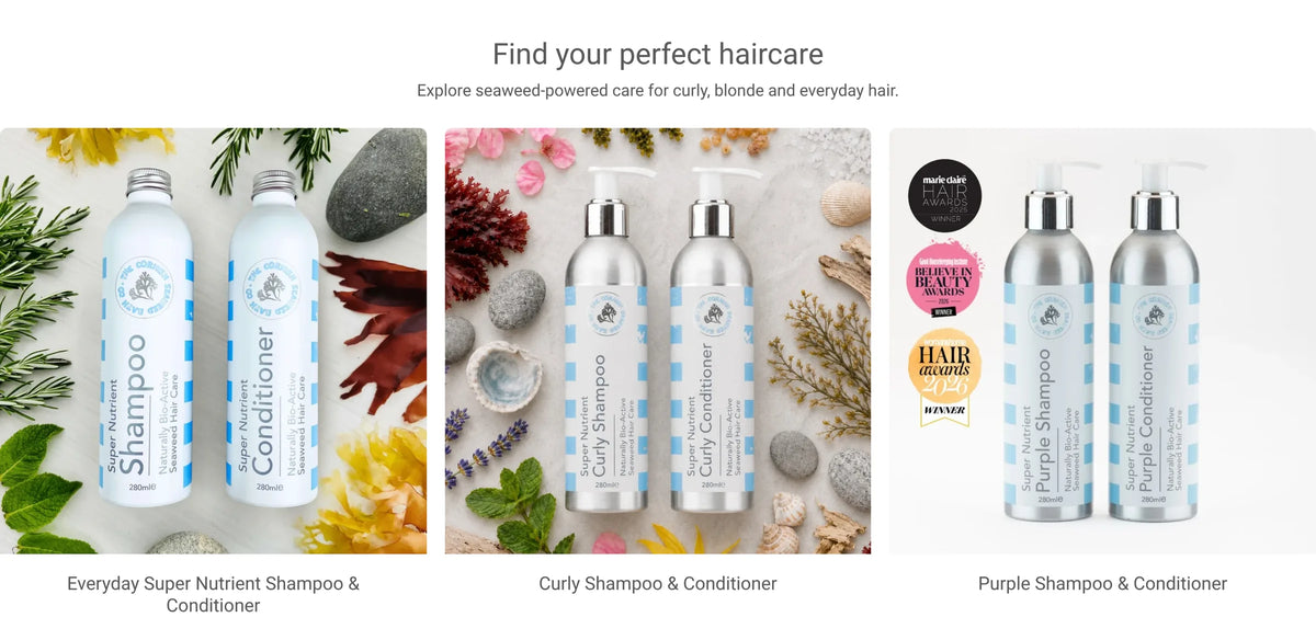
Redesigned homepage, routing visitors to the right haircare for their hair type
What comes next

Where the next gains are.

The partnership is still running, across subscriptions, offers, landing pages and the homepage.

  1. Roll out sentence case

    Take the winning copy style across the haircare landing pages and the rest of the site.

  2. Subscriptions without pressure

    Subscriptions are live. The biggest losses came from pressure framing, so the next subscription tests lead with value, including after the first purchase.

  3. Help undecided visitors choose

    Build on the routing by hair type that is now part of the homepage.

Work with us

Your customers might already love the product. Does your website explain why?

We use your own customer data to find what stops people buying, design the fix and test it against the original. You keep what wins.

Plans and pricing

Work with PM Digital.

Book a call with Paddy, our founder. It's a chat to see where the brand is and what it needs. We'll do an audit only if it's needed.

  • CRO sprint £4,000 one-off
  • The CRO & Scale Plan £6,000 / month
  • CRO and creative From £10,000 / month

The 90-day guaranteeIf we don't get you a winning test in 90 days, we work the next 30 free until we do.See terms