Case Studies › Suzushii

How a shop by theme homepage lifted Suzushii's revenue per visitor by 11%

× PMDIGITAL
DESIGN
+11%
Revenue per visitor from the shop by theme homepage
+9%
Revenue per visitor from the Buy 2 Get 1 Free offer module
+16%
Revenue per visitor on mobile, homepage test
suzushiiclothing.com
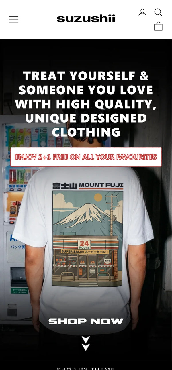
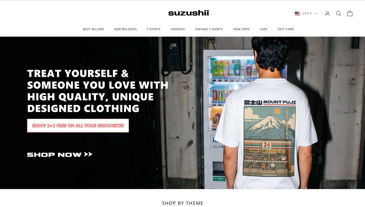
Suzushii homepage on mobile with the shop by theme entries on the first screenSuzushii homepage with the shop by theme entries now on the first screen
Client
Suzushii
Industry
Apparel, Japanese inspired graphic tees and hoodies
Platform
Shopify · Intelligems
Engagement
CRO & Scale Plan, ongoing post click work
The challenge

A strong offer that shoppers had to work out for themselves.

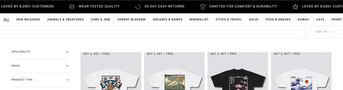
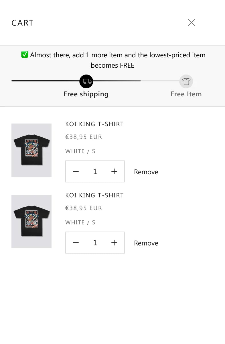
Buy 2 Get 1 Free already drove how people bought. Most orders landed on exactly three items. But the offer was easy to miss at the moments that mattered: the homepage hero took up most of the first screen while getting very little engagement, product pages left shoppers to do the maths on savings, and the cart did not make it obvious how close someone was to a free item. Most visitors browse on a phone, so every extra scroll and every unclear message cost sales.

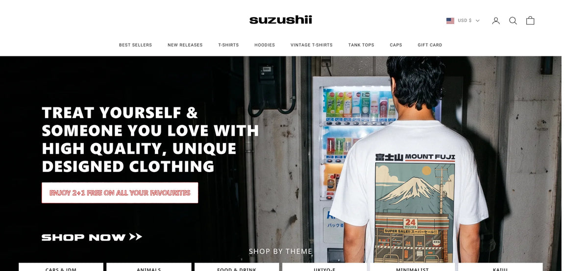
Before · original homepage design, a tall hero above the products
Suzushii original homepage design on desktop with a full height hero
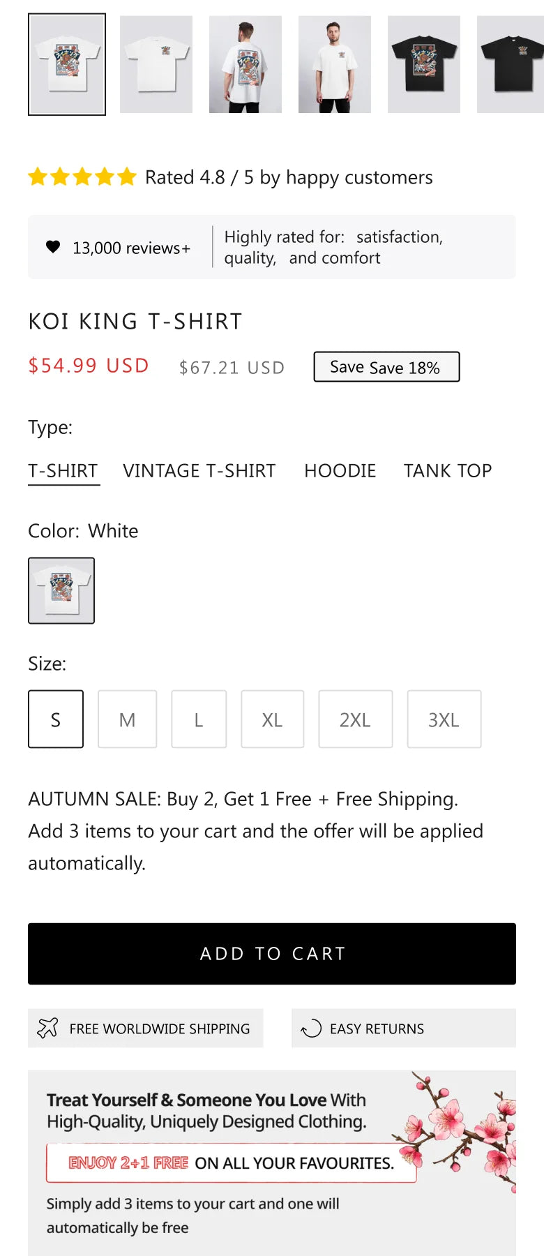
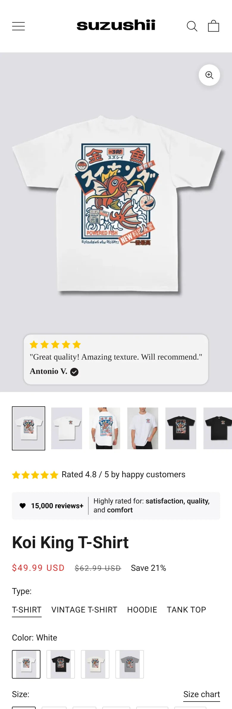
Product page on mobile, where most shoppers buy
Suzushii product page on mobile showing the price and saving badge
  1. 01Friction point

    Where do I find the designs I like?

    The homepage hero filled the first screen and got little engagement.

  2. 02Friction point

    How does Buy 2 Get 1 Free work?

    The offer was there, but shoppers had to work out how to use it.

  3. 03Friction point

    Will it fit?

    18% of surveyed buyers named sizing as their biggest friction.

  4. 04Friction point

    How much am I saving?

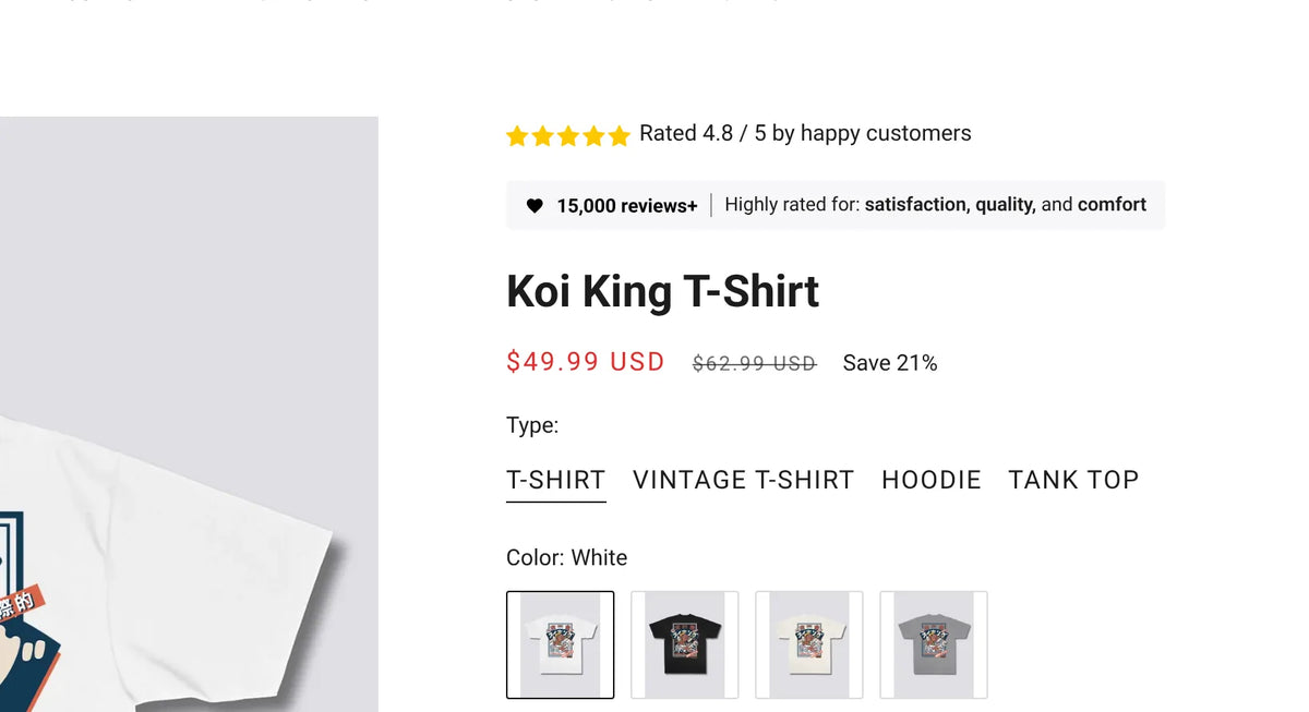
    A crossed out price left the saving for shoppers to calculate.

The research

What the data told us before we tested.

Every test started from Suzushii’s own customer data: post purchase surveys, order patterns and the results of earlier tests on the account.

  1. Post purchase survey, 2,953 buyers
    • What we found56% named Buy 2 Get 1 Free as the offer most likely to bring them back.
    • What we didBuild the buy box around the offer people already want, instead of adding a new discount.
  2. Order data
    • What we found62% of orders land on exactly three items.
    • What we didShoppers are already working towards the free item. Show progress towards it.
  3. Earlier test results
    • What we foundTheme led browsing had already won on the Best Sellers page.
    • What we didBring the same theme entries onto the homepage first screen.
The strategy

Make the offer obvious. Shorten the route to the right product.

We worked on four levers. Navigation, so shoppers reach the designs they care about faster. Offer clarity, so Buy 2 Get 1 Free is visible and easy to act on. Reassurance, so fit and quality doubts are answered where people hesitate. And value, so the saving is shown, not implied. Each idea ran as an A/B test on Intelligems, and only versions that beat the original were kept.

  • The goal was notHow do we get more traffic?
  • It wasHow do we make each visit to Suzushii worth more?
  • How we worked
  • Navigation
  • Offer clarity
  • Reassurance
  • Value

CRO Brain and PMD Cortex AIEvery result here went into Suzushii's CRO Brain, our running record of what their customers respond to. PMD Cortex AI, our own AI system, learns from every test we run, and our developers manage the bots, so each new test starts from what has already worked.

How the partnership grew
  1. Stage 1

    Collection pages, price and cart

    A benefits bar on Best Sellers, a saving badge beside the price, and a single progress message in the cart.

  2. Stage 2

    Reassurance at the cart

    Cart reviews chosen for what they say about fit and quality.

  3. Stage 3

    Homepage and offer module

    Shop by theme on the first screen, then a buy box built around Buy 2 Get 1 Free.

The work

Six winning tests, one principle each.

01 · Homepage · shop by theme

Put the route to the product on the first screen.

The original homepage led with a tall hero that most visitors scrolled past. We shortened it and brought six shop by theme entries onto the first screen: Cars & JDM, Animals, Food & Drink, Ukiyo-e, Minimalist and Kaiju. Each one goes straight to that collection.

+11%Revenue per visitor
+4%Conversion rate
+16%Revenue per visitor on mobile
+14% to +21%Revenue per visitor from search visitors
  • What changedA shorter hero with six theme entries on the first screen, using the same themes that already worked on the Best Sellers page.
  • HypothesisIf shoppers can jump straight to the theme they came for, more of them will reach a product and buy.
  • Why it wonVisitors arriving from search and on mobile already know what they like. Giving them a direct route into a theme removed a scroll and a guess.
Before · original homepage, mobile
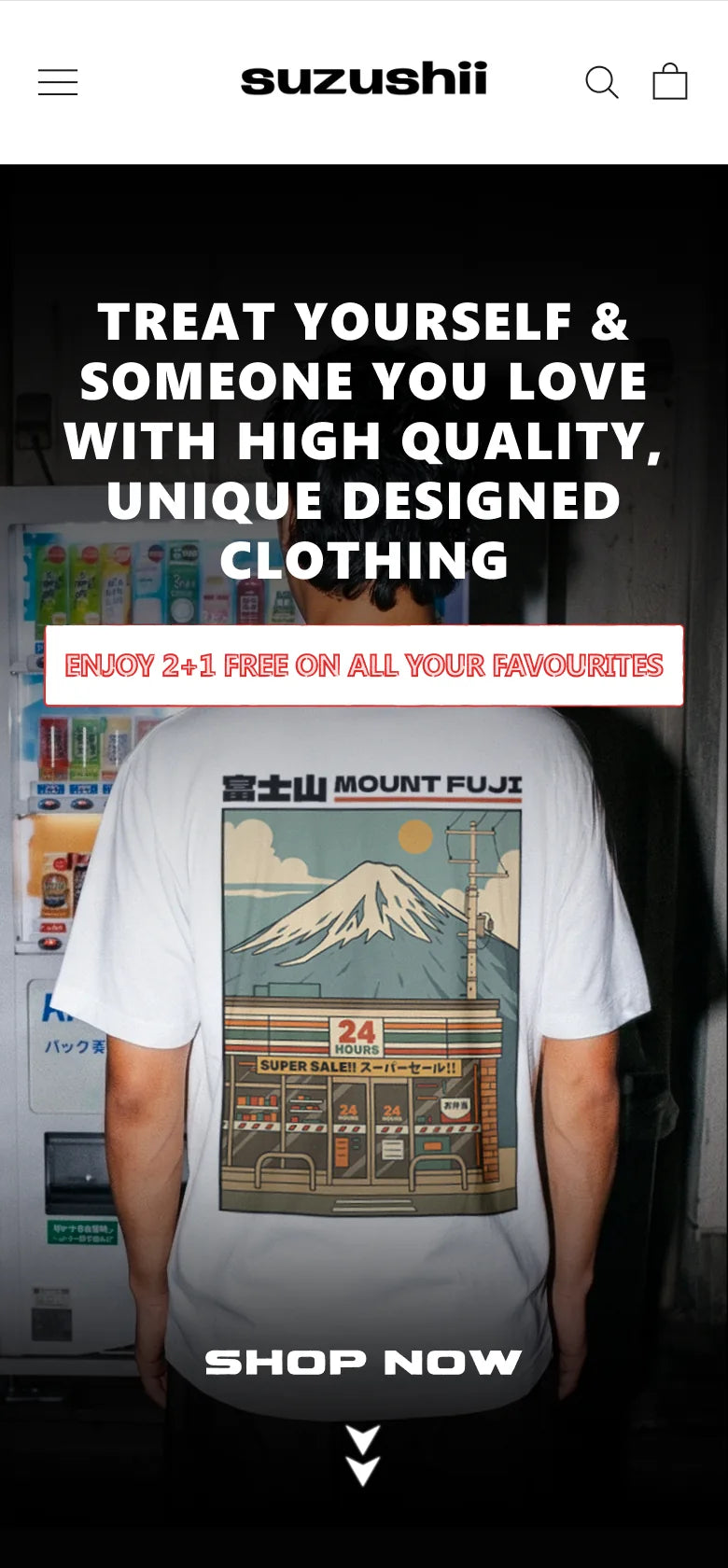
Suzushii original homepage design on mobile, theme entries below the hero
After · theme entries on the first screen
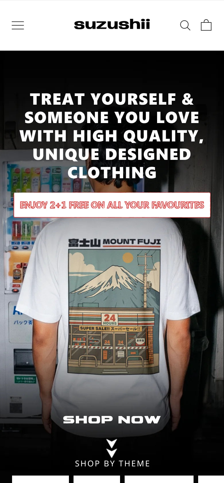
Suzushii homepage design on mobile with the theme entries inside the first screen
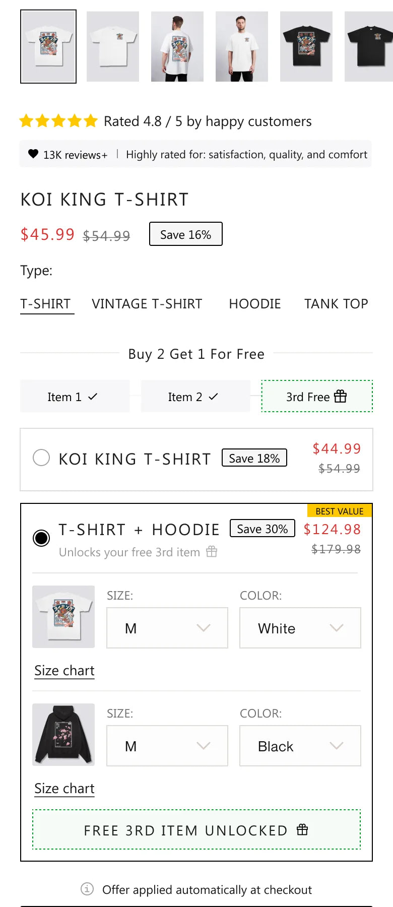
02 · Product page · offer module

Build the buy box around the offer people already want.

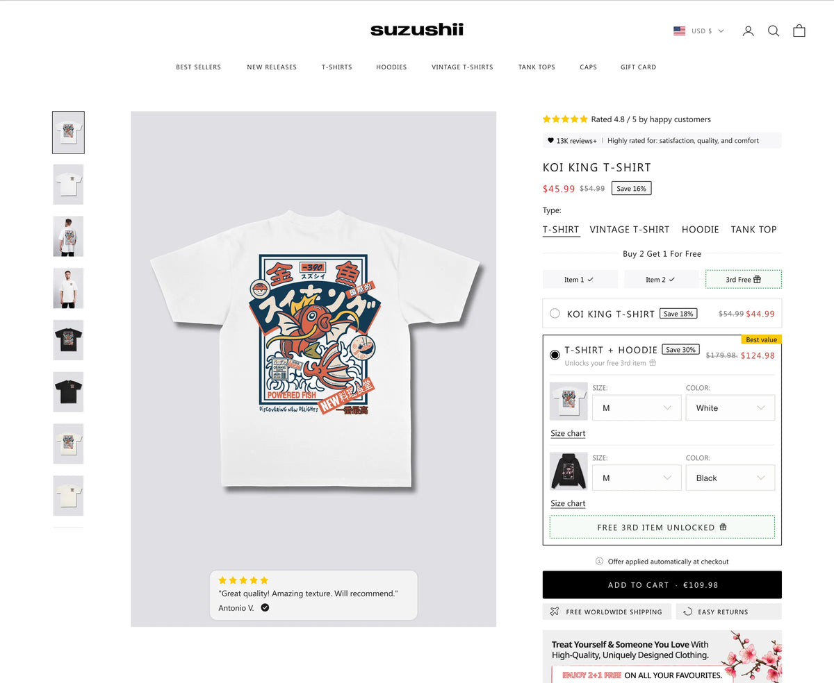
We redesigned the buy box into an offer module. Shoppers could pick a single item or a matching tee and hoodie set, framed as progress into Buy 2 Get 1 Free. No new discount was added. The version with the set pre selected won.

+9%Revenue per visitor
+7%Conversion rate
+29%Revenue per visitor from returning visitors
+9%Revenue per visitor on mobile
  • What changedA selectable offer module, with a matching tee and hoodie set pre selected and shown as a step towards the free item.
  • HypothesisIf the offer is visible and easy to act on at the moment of choice, more visitors will complete an order.
  • Why it wonThe lift came from more completed orders rather than bigger baskets. Returning visitors, who already understood the offer, responded most. New visitors were roughly level, which is the next thing to solve.
Before · original buy box, mobile
Suzushii original product page buy box on mobile before the offer module
After · offer module with the set pre selected
Suzushii product page on mobile with the offer module and the matching set pre selected
Winning design on desktop
Suzushii product page design with the Buy 2 Get 1 Free offer module and the tee and hoodie set selected
03 · Cart · reviews about fit

Answer the sizing question where people commit.

Earlier testing showed the cart was the most valuable place for social proof on this store. We changed the cart reviews to ones that talk about fit and quality, because sizing was the biggest worry left at that point.

+4%Revenue per visitor
+5%Conversion rate
  • What changedCart drawer reviews chosen for what they say about fit and quality, in place of general praise.
  • HypothesisIf the cart answers the fit question, more shoppers will go on to checkout.
  • Why it wonGeneric praise does not settle a sizing doubt. A review that says it fits true to size does, right before checkout.
Live cart drawer on mobile
Suzushii cart drawer on mobile with customer reviews and the progress bar
04 · Collection page · benefits bar

Show the reasons to buy while people browse.

We added a short benefits strip to the top of the Best Sellers collection page, covering the offer, quality and easy returns, so shoppers see the value while scanning designs.

+4%Revenue per visitor
+5%Conversion rate
  • What changedA concise benefits bar above the product grid on Best Sellers.
  • HypothesisIf shoppers get reassurance and a clear value signal while scanning, more of them will click through and buy.
  • Why it wonReassurance works best before the decision, not after it. The bar puts the offer and the guarantees in view at the first step.
Live Best Sellers page with the benefits bar
Suzushii Best Sellers collection page with the benefits bar above the products
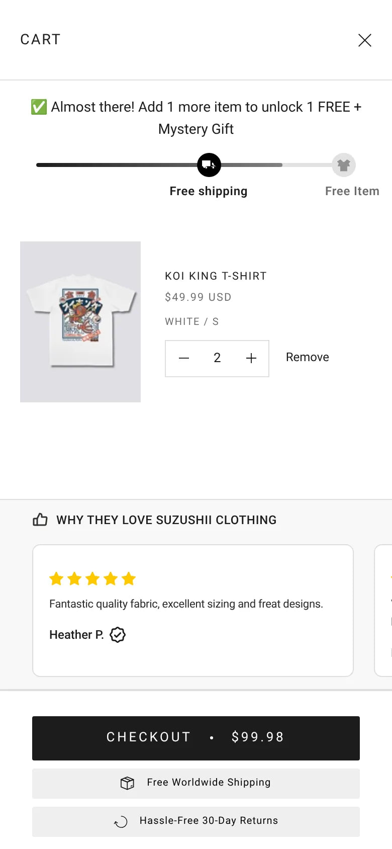
05 · Cart · progress message

One message, one goal: the free item.

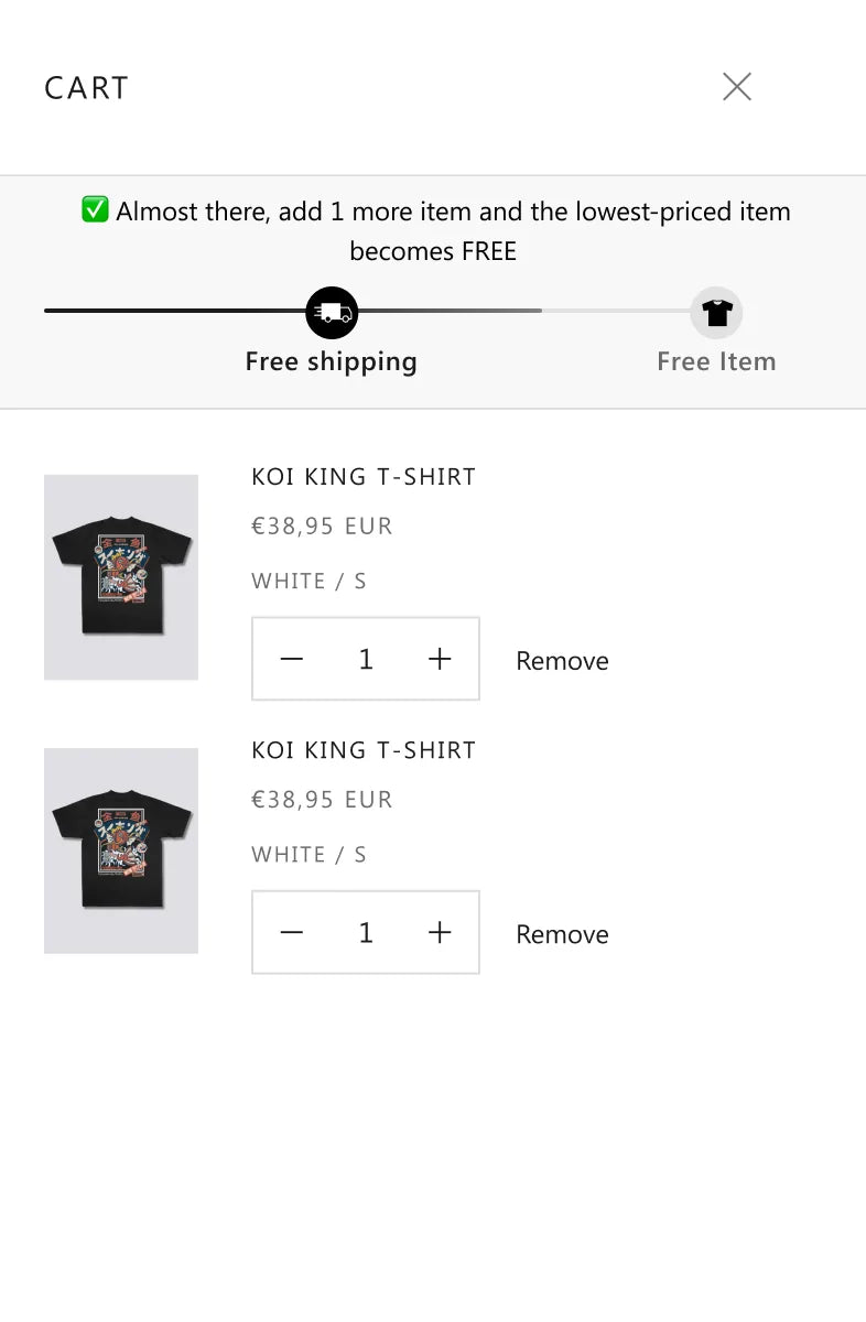
The cart showed more than one incentive at once. We replaced it with a single message about Buy 2 Get 1 Free, telling shoppers exactly how many more items unlock the free one.

+3%Revenue per visitor
+3%Conversion rate
  • What changedA single purpose progress message in the cart, tied only to the existing offer.
  • HypothesisIf the cart shows only progress towards an offer shoppers already trust, more of them will reach it.
  • Why it wonFewer messages meant less to think about. Shoppers already believed the offer, so a simple reminder of how close they were was enough.
Before · original cart design
Suzushii original cart progress bar design
After · one progress message
Suzushii cart design with a single message telling shoppers how close they are to a free item
06 · Product page · saving badge

Show the saving, do not imply it.

We added a clear saving percentage beside the price on product pages and used the plain wording Buy 2, Get 1 Free throughout.

+2%Revenue per visitor
+2%Conversion rate
  • What changedA saving label next to the current price, with clearer offer wording.
  • HypothesisIf the value is obvious at the decision point, shoppers do not have to calculate it, and more of them buy.
  • Why it wonA crossed out price asks the shopper to do the maths. A saving label does it for them, which matters most on a small screen.
Live product page on mobile
Suzushii product page on mobile showing the price and saving badge
Why it won

What made the difference, section by section.

Each row links to the test above. The figure is the lead result from the test log.

  1. 101 · Homepage · shop by theme

    Put the route to the product on the first screen.

    Visitors arriving from search and on mobile already know what they like. Giving them a direct route into a theme removed a scroll and a guess.

    +11%Revenue per visitor
  2. 202 · Product page · offer module

    Build the buy box around the offer people already want.

    The lift came from more completed orders rather than bigger baskets. Returning visitors, who already understood the offer, responded most. New visitors were roughly level, which is the next thing to solve.

    +9%Revenue per visitor
  3. 303 · Cart · reviews about fit

    Answer the sizing question where people commit.

    Generic praise does not settle a sizing doubt. A review that says it fits true to size does, right before checkout.

    +4%Revenue per visitor
  4. 404 · Collection page · benefits bar

    Show the reasons to buy while people browse.

    Reassurance works best before the decision, not after it. The bar puts the offer and the guarantees in view at the first step.

    +4%Revenue per visitor
  5. 505 · Cart · progress message

    One message, one goal: the free item.

    Fewer messages meant less to think about. Shoppers already believed the offer, so a simple reminder of how close they were was enough.

    +3%Revenue per visitor
  6. 606 · Product page · saving badge

    Show the saving, do not imply it.

    A crossed out price asks the shopper to do the maths. A saving label does it for them, which matters most on a small screen.

    +2%Revenue per visitor
Honest accounting

Not every test won. That is the point.

We logged 16 tests on Suzushii. Seven were marked as winners and six of those have full figures, shown above. The smaller wins of 2% to 4% are directional rather than conclusive, so we read them alongside the bigger tests. These are the tests that did not beat the original, and what they taught us.

16Tests run
7Winners
9Flat or negative, documented
  1. Lost

    Delivery date above Add to cart

    Revenue per visitor fell 11% and the test was switched off. The date made shoppers less likely to commit, especially on mobile.

  2. Did not beat the original

    Popularity badges on collection tiles

    None of the three badges beat plain tiles. New visitors from paid social did not value the popularity signal.

  3. Level

    Simplified size guide

    Desktop rose by around 14%, but on mobile, 93% of visitors, add to cart dipped 3%. The two cancelled out.

  4. Inconclusive

    Bundle prompt before the product page

    First time visitors, about 85% of traffic, spent 9% less per visit. Not rolled out.

The result

Small improvements across the journey compound.

No single change carried the account. The homepage and the offer module each added around a tenth to revenue per visitor in their tests, while the cart, collection page and price changes each added a few percent at their own step of the journey. All figures are from Suzushii’s A/B tests, each measured against the original page at the same time.

+11%Revenue per visitorHomepage, shop by theme
+9%Revenue per visitorProduct page offer module
+7%Conversion rateProduct page offer module
+29%Returning visitor revenue per visitorProduct page offer module
  • 6 winning tests documented
  • 5 winning changes live on the store
  • 16 tests logged
  • 0 new discounts needed
Implementation status

The shop by theme homepage, the saving badge, the benefits bar, the cart progress message and the cart reviews are live on the store. The offer module was recommended for rollout after its test.

Live product page, with the saving shown beside the price
What comes next

Where the next gains are.

  1. Win over first time visitors

    The offer module helped returning shoppers most. The next test is a version written for people who have never bought before.

  2. Confirm the homepage lift at scale

    A follow up test on a larger sample, including paid social traffic.

  3. Fix sizing on mobile

    The size guide helped on desktop. A mobile version that does not sit between the size buttons and Add to cart is next.

Work with us

Your offer might already be strong enough. Is your store showing it?

We find where shoppers hesitate, design the fix and test it against the original. You keep what wins.

Plans and pricing

Work with PM Digital.

Book a call with Paddy, our founder. It's a chat to see where the brand is and what it needs. We'll do an audit only if it's needed.

  • CRO sprint £4,000 one-off
  • The CRO & Scale Plan £6,000 / month
  • CRO and creative From £10,000 / month

The 90-day guaranteeIf we don't get you a winning test in 90 days, we work the next 30 free until we do.See terms